Preview image. Unlock full-res
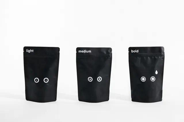
A minimalist two-color palette study featuring near-white and near-black, exemplifying extreme contrast through tonal extremes and minimal saturation variation.
Summary
An ultra-minimalist two-color palette consisting of near-white (#F7F7F7) and near-black (#212326), creating maximum visual contrast through tonal opposition with zero chromatic variation.
Visual description
This palette reduces color to its most essential state: light and dark. The near-white is warm and slightly off-pure-white, suggesting paper or natural material. The near-black is deep and true, avoiding pure #000000 by adding a hint of blue-gray undertone. The contrast is stark and dramatic—these are the two most opposite values on the brightness scale. With no color hue present, all visual interest derives entirely from tonal relationship and luminosity. This creates a pristine, disciplined aesthetic.
Key takeaway
Extreme tonal contrast alone can create striking visual impact without any chromatic variation. This approach forces design to rely on form, composition, and spatial relationships rather than color interest. The result feels technical, clean, and intellectually rigorous.
Reuse notes
Ideal for minimal branding, technical documentation, architectural presentations, or avant-garde design. Works exceptionally well for print where color fidelity is secondary. The palette suits crisp, geometric typography and layouts. Perfect for luxury brands emphasizing restraint and sophistication. Can feel cold—soften by introducing cream or off-white variations rather than pure white. Works well in digital interfaces when paired with generous whitespace. Consider introducing a single accent color if more visual warmth is needed.
More like this





Keep what you find
A free account saves references to boards and can send you a weekly email of picks based on what you save.
To see every result, go Pro.