Preview image. Unlock full-res
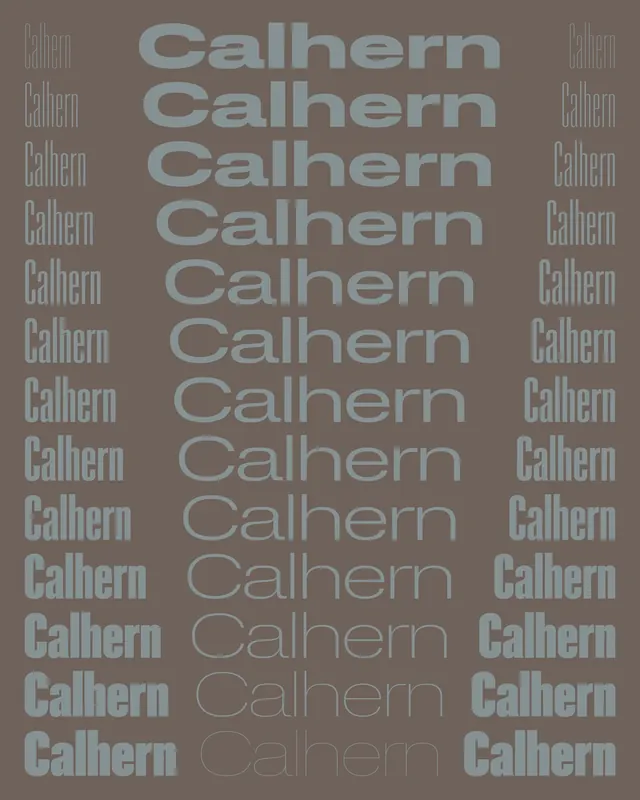
A typographic study featuring the word "Calhern" repeated and layered in various scales and opacities against a taupe background.

Summary
A typographic composition layering the word "Calhern" repeatedly at different scales and opacities, creating a visual hierarchy and rhythm through repetition and transparency.
Visual description
Taupe background with the typeface name "Calhern" repeated in horizontal rows. Each instance varies in scale and opacity—bold at center, fading lighter toward edges and bottom—creating depth and visual interest through layering.
Key takeaway
Repetition and opacity variation can create motion and depth in static typography without additional visual elements.
Reuse notes
Effective for type specimen presentations or educational typography materials showcasing a single font's personality at multiple scales.
More like this


Keep what you find
A free account saves references to boards and can send you a weekly email of picks based on what you save.
To see every result, go Pro.