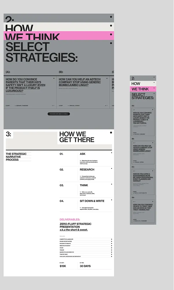
Preview image. Unlock full-res
Multi-page strategy document template with stark grid layout, magenta accent color, and numbered section hierarchy for consulting deliverables.
Summary
Multi-page strategy document template with stark grid layout, magenta accent color, and numbered section hierarchy for consulting deliverables.
Visual description
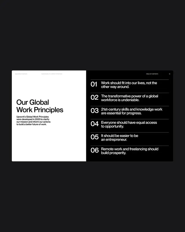
A composite image showing three consecutive pages of a strategy document. The first page reads "How We Think Select Strategies" with a bright magenta vertical bar (one character wide) acting as a visual separator. The layout is rigorous: left column for headings and section numbers (numbered 01 through 04, one per page), right column for body copy and supplemental information. The type treatment is spare, with high contrast between thin sans-serif display type and smaller body text. Grey dividers and thin rule lines separate sections. Pages 2 and 3 stack vertically on the right, showing consistent grid structure and the magenta accent reappearing. No illustration, no photography, only typography and structured whitespace. The overall impression is precise, controlled, and designed for dense information delivery.
Key takeaway
The vertical magenta bar as a single, powerful accent that unifies all pages without distraction. The numbered section system that gives readers an instant sense of progress and information architecture. The disciplined left-right column layout that handles different content types (headings, copy, sidebars) within a consistent grid.
Reuse notes
Essential for b2b consulting, strategy reporting, or any formal business deliverable that must convey expertise and professionalism. The stark color palette (black, white, grey, one accent) is highly copyable and works across print and digital. Works best when content is genuinely complex or multi-step; the structure rewards information density.
More like this


Keep what you find
A free account saves references to boards and can send you a weekly email of picks based on what you save.
To see every result, go Pro.