Preview image. Unlock full-res
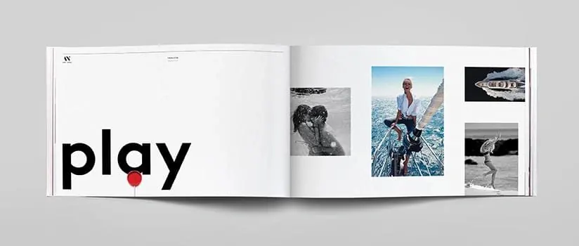
An open magazine spread featuring bold sans-serif "play" headline with accent dot, adjacent to a grid of curated photography.
Summary
A contemporary magazine spread with a left-page section heading "play" in bold oversized sans-serif with a small red circular accent, paired with a right-page 2x2 photography grid in grayscale and color photography.
Visual description
The left page holds the word "play" in large black sans-serif, anchored by a small red dot positioned as a subtle typographic accent. The clean white background gives the text room to breathe. The right page displays four photographs in a 2x2 grid arrangement: a mix of black-and-white architectural shots, color environmental photography, and candid lifestyle imagery. The photographs maintain visual cohesion through consistent cropping and neutral color palette, suggesting a unified editorial voice or portfolio theme.
Key takeaway
Oversized typography paired with white space creates visual "air" and confidence in editorial design. A single accent color (the red dot) applied minimally but strategically draws the eye and prevents pure monochromatic monotony. Grid-based photography layouts create rhythm and allow diverse imagery to feel collected and curated.
Reuse notes
Strong reference for editorial design, artist portfolio layouts, or cultural magazines prioritizing visual clarity. The black-and-white palette suits luxury, lifestyle, or artistic contexts. The minimal typography approach works well for high-end publications, exhibition catalogs, or design systems emphasizing content over decoration. The red accent can be adapted to any brand color.
More like this


Keep what you find
A free account saves references to boards and can send you a weekly email of picks based on what you save.
To see every result, go Pro.