Preview image. Unlock full-res
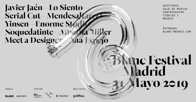
Editorial design poster for a cultural event featuring bold typographic hierarchy, event details, and sponsor logos arranged in a clean, minimalist layout.
Summary
A minimalist event poster using elegant sans-serif typography, event metadata (date, location, ticket information), and sponsor logos arranged in a balanced grid on a light neutral background.
Visual description
A light gray background creates a calm, gallery-like aesthetic. Bold black sans-serif typography dominates, listing event names, artist names, and key information in a grid arrangement. Sponsor logos (small, grayscale) are positioned discretely. Centered on the page is larger display text highlighting the main event title. Thin horizontal rules separate sections and provide visual breathing room. The layout is asymmetrical but balanced, with generous whitespace allowing each typographic element to breathe. A small red accent dot appears as a subtle visual punctuation. All supporting information (dates, location, website URL) is set in smaller point sizes in a clean hierarchy.
Key takeaway
The sophistication of typography-driven design that relies on hierarchy, scale, and whitespace rather than imagery or decoration. The restraint in color (nearly monochrome with one accent) and the generous negative space convey cultural credibility and prestige, common to high-end events, galleries, and festivals.
Reuse notes
Reference for museum exhibitions, film festivals, theater productions, or high-culture event marketing. Useful for studying typographic hierarchy, grid-based layout, and the use of whitespace to convey sophistication. Works well for print applications (posters, programs, invitations) and also translates effectively to digital interfaces.
More like this
Keep what you find
A free account saves references to boards and can send you a weekly email of picks based on what you save.
To see every result, go Pro.