Preview image. Unlock full-res
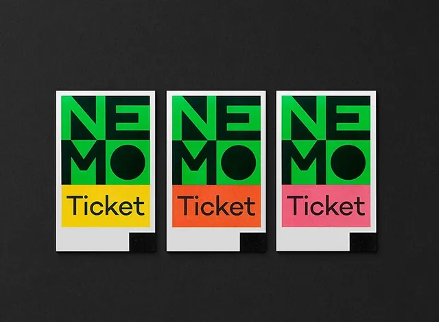
Three variation cards with bold neon-green geometric logo, color-blocked sections, and minimalist text layout—systematic branding approach.
Summary
Three variation cards with bold neon-green geometric logo, color-blocked sections, and minimalist text layout—systematic branding approach.
Visual description
A systematic modular design composition showing three identical card templates with deliberate color variations. Each card features an identical geometric logo in neon green (angular forms suggesting a stylized double-angle), mounted on a white card stock with black shadow beneath. Below the logo sits a color-blocked banner section—one yellow, one orange, one pink—each with the word 'Ticket' in bold black sans-serif. The entire composition sits on a dark charcoal background. The design demonstrates systematic thinking through identical structure and strategic color variation.
Key takeaway
Modular design systems become more impactful with strategic color variation while maintaining identical structure. Neon color intensity against white and black creates maximum contrast and visual drama. Typography treatment (simple, bold, centered) emphasizes legibility and design order.
Reuse notes
Excellent reference for event ticketing systems, membership card design, or branding systems. The modular variation approach is applicable to any product or service needing systematic but visually distinct versions. The neon-on-white-and-black color strategy works for high-impact applications requiring quick visual differentiation. Useful for music festivals, events, or youth-oriented brands.
More like this


Keep what you find
A free account saves references to boards and can send you a weekly email of picks based on what you save.
To see every result, go Pro.