Preview image. Unlock full-res
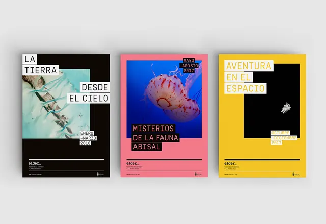
Identity design composition with dark navy base, light stone gray, and strategic gold accent creating premium museum aesthetic.
Summary
A museum identity composition balancing deep navy and light stone gray with a confident gold accent, exemplifying premium institutional design.
Visual description
Landscape format (1650x1137). Dark navy #151B38 (49%) provides sophisticated grounding. Light stone gray #DED5D5 (41%) creates breathing room and balance. Gold accent #E8BF2A (6%) delivers premium visual punch. Deep rose #995970 (2%) adds subtle complexity. Hierarchical color use emphasizing restraint with strategic accent.
Key takeaway
Strategic color hierarchy in institutional design: a dominant pair (dark+light) anchors the composition, while the accent (gold) guides attention and conveys premium value without overwhelming.
Reuse notes
Reference for museum, gallery, cultural institution, or premium brand identity systems. The balanced dark-light split with gold accent is particularly effective for logos, systems materials, and brand applications requiring sophistication and authority. Works well for signage, print, and digital applications.
More like this



Keep what you find
A free account saves references to boards and can send you a weekly email of picks based on what you save.
To see every result, go Pro.