Preview image. Unlock full-res
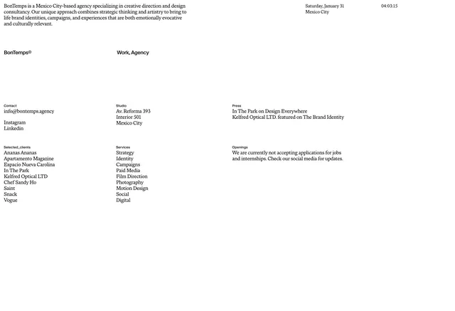
A dark, minimalist agency portfolio layout showcasing the BonTemps brand identity with sophisticated typography and layout hierarchy.
Summary
A dark-themed agency portfolio layout from BonTemps showcasing minimalist design principles with careful typography and spatial hierarchy on a dark background.
Visual description
Dark background with white and light gray typography. Large, bold sans-serif headings establish visual hierarchy. Careful use of negative space guides the eye. Layout is asymmetric with strategic element placement. The overall composition emphasizes sophistication and professionalism through restraint.
Key takeaway
Dark mode agency portfolios benefit from bold, oversized type and generous whitespace. The contrast between text and background creates strong visual impact without relying on color.
Reuse notes
Strong reference for dark corporate/agency layouts. The oversized typography pattern works well for B2B professional services. Requires confident use of whitespace to succeed.
More like this


Keep what you find
A free account saves references to boards and can send you a weekly email of picks based on what you save.
To see every result, go Pro.