Preview image. Unlock full-res
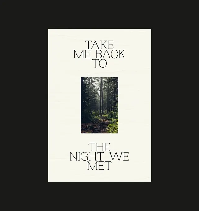
High-contrast image with strong dark-to-light split, emphasizing typographic or minimal spatial arrangement.
Summary
A high-contrast composition built on a near 50/50 split between deep charcoal and off-white, creating stark visual separation.
Visual description
Square-ish portrait image (1400x1487). Color palette dominated by two tones: dark charcoal #1F1F1F (65% of space) and near-white cream #F2F2E9 (35%). Minimal visual detail, relying on tonal contrast for hierarchy and impact.
Key takeaway
The power of binary contrast in minimalist composition. Two colors, no compromise, creating clear visual hierarchy and legibility.
Reuse notes
Strong foundation for typography-forward layouts. Works well for editorial, brand, or portfolio contexts where contrast and clarity are priorities. The near-equal split suggests potential two-column or split-screen application.
More like this

Keep what you find
A free account saves references to boards and can send you a weekly email of picks based on what you save.
To see every result, go Pro.