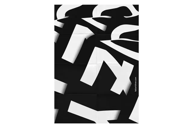
Preview image. Unlock full-res
An extreme high-contrast composition split almost equally between near-white and near-black, exemplifying ultra-minimalist graphic design.
Summary
A stark, minimalist composition divided between near-pure white and near-pure black, with essentially no middle tones—the epitome of binary design thinking.
Visual description
Approximately 63% near-white (#F7F7F7) balanced against 36% near-black (#171717). The division is clean and intentional, likely used as a graphic divider, conceptual statement, or thematic element in a larger design system. No texture, detail, or gradation—just two complementary extremes meeting at an implied line.
Key takeaway
The power of extremes: two opposing tones create immediate visual hierarchy and conceptual clarity without any embellishment. Perfect for conveying simplicity, duality, or technical precision.
Reuse notes
Use as a divider between sections, a conceptual hero image (on/off, light/dark, forward/back), or in branding that embraces radical simplicity. Works especially well for tech, fintech, or minimalist brands. May feel austere without supporting warm imagery or rich typography.
More like this








Keep what you find
A free account saves references to boards and can send you a weekly email of picks based on what you save.
To see every result, go Pro.