Preview image. Unlock full-res
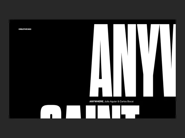
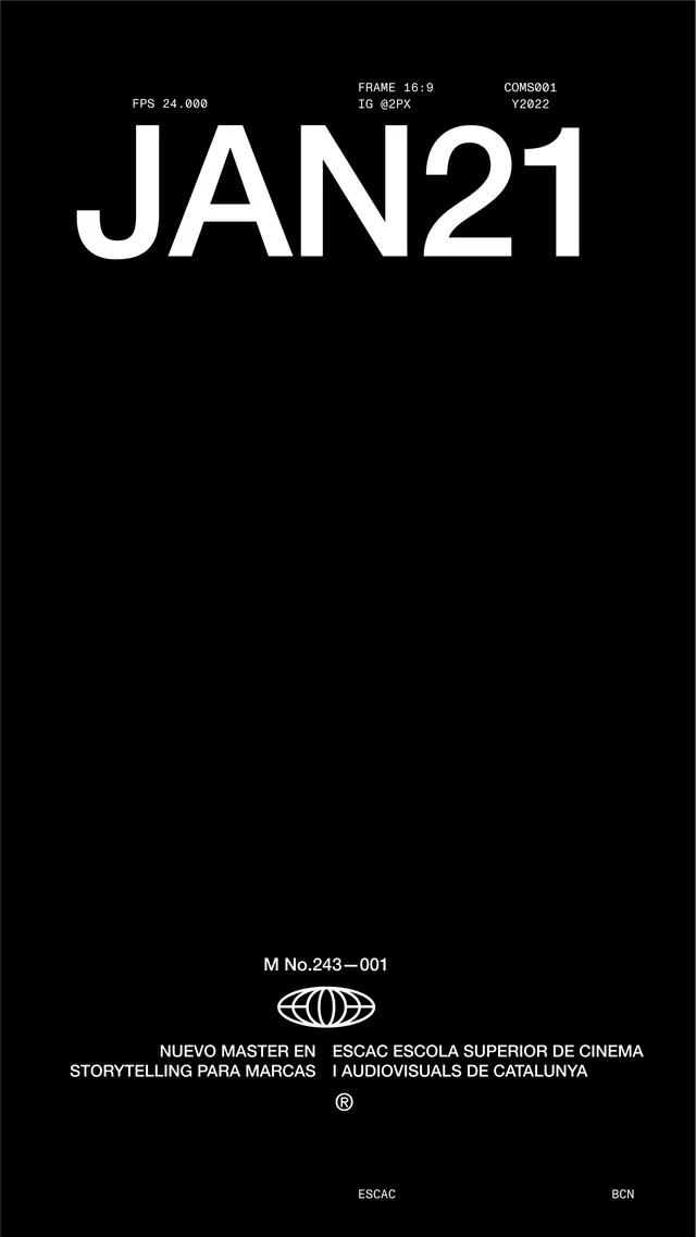
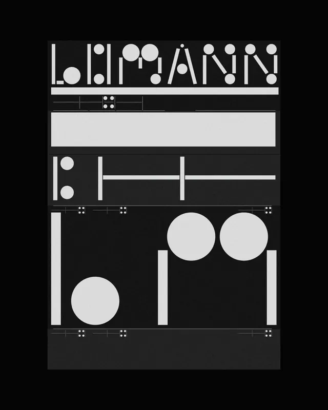
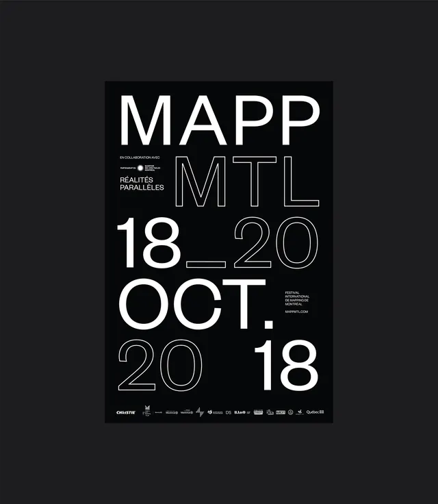
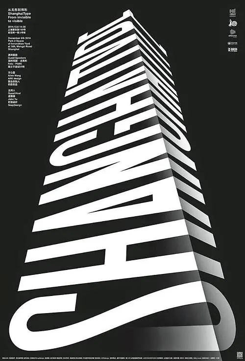
A layered composition combining structured sans-serif type with organic handwritten or brush-stroke elements for visual contrast.
Summary
A layered composition combining structured sans-serif type with organic handwritten or brush-stroke elements for visual contrast.
Visual description
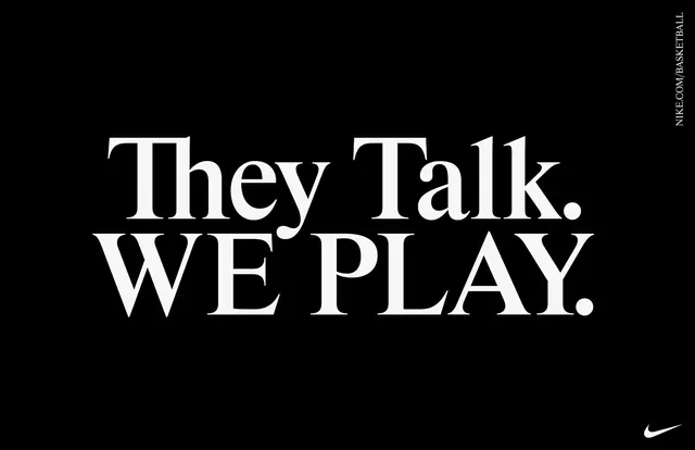
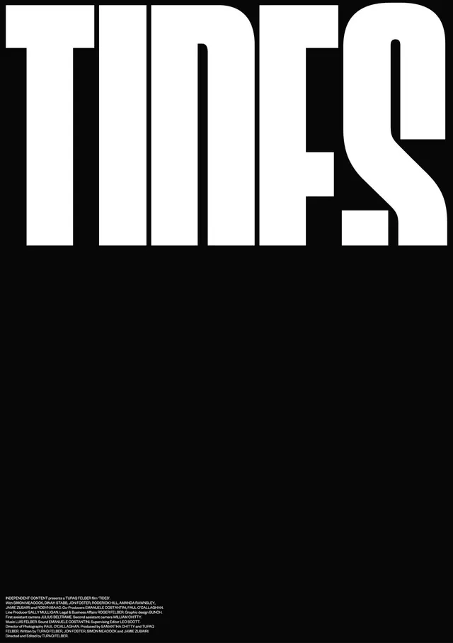
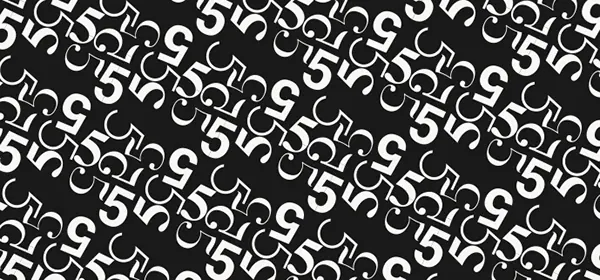
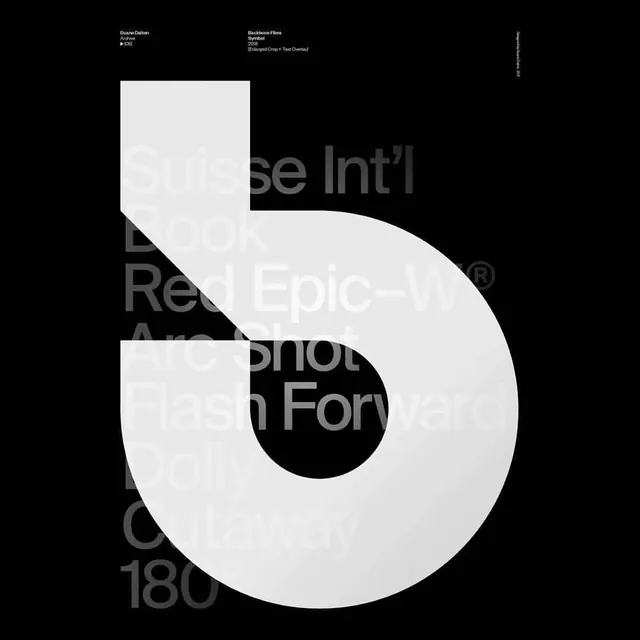
An asymmetric poster featuring two typographic systems in dialogue. Large, bold clean sans-serif letters anchor one side in black. Overlapping or adjacent is more organic, hand-drawn, or brushed letterforms in a lighter tone or white, suggesting less formal handwriting. The contrast between structured and organic type creates visual tension. Dark background, likely black or very dark gray, with white and possibly one accent color creating contrast.
Key takeaway
Pairing systematic sans-serif with organic handwritten or painted type for personality and warmth. Asymmetric balance between order and chaos. Two typefaces working in dynamic contrast rather than harmony.
Reuse notes
Works for creative industries, workshops, events, or brands wanting personality over polish. The handwritten element adds human touch but can reduce legibility if overused. Best at larger scales where the handwritten detail is readable. Avoid for corporate or ultra-formal contexts.