Preview image. Unlock full-res
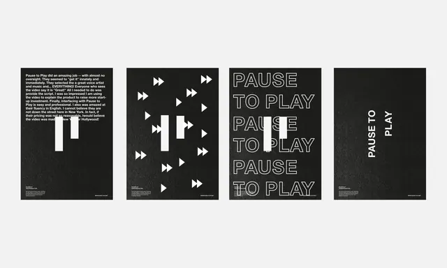
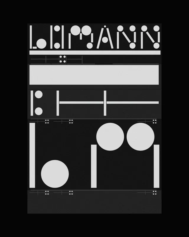
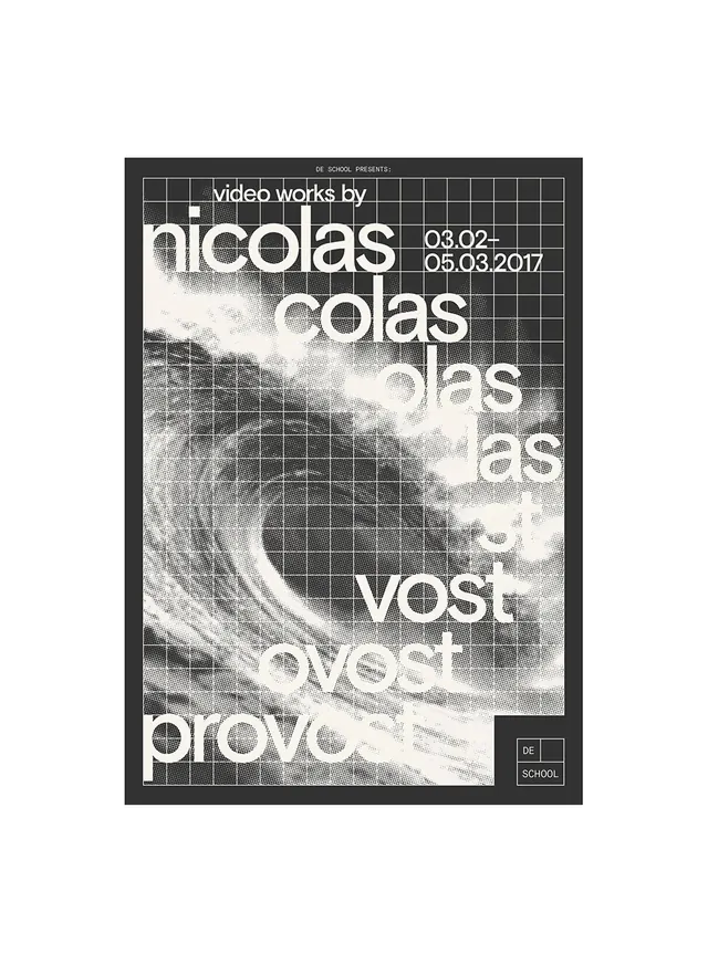
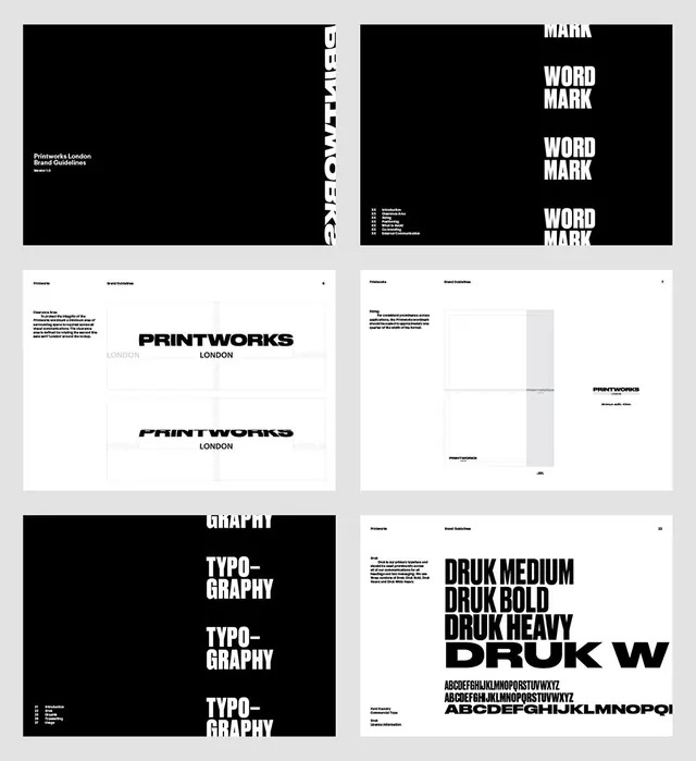
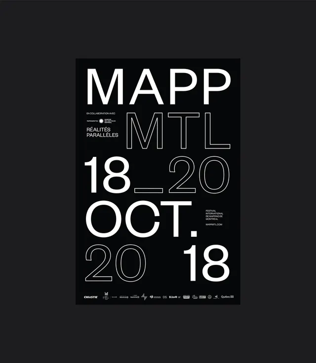
High-contrast black festival poster for "MAPP MTL" featuring bold outlined and solid sans-serif typography arranged in varied weights and scales.
Summary
Monochromatic festival poster for an international contemporary art marketplace event, using bold outlined and solid sans-serif typography at varying scales to create visual hierarchy and movement.
Visual description
Pure black background with white and grey sans-serif typography arranged without centered alignment. Main title "MAPP MTL" is presented in two visual styles—"MAPP" in bold outlined letters and "MTL" in a mix of outlined and solid weights. Supporting text "RÉALITÉS PARALLELES" in smaller upper text, festival information and logos in lower right. The typography varies in weight, size, and treatment (outline vs. solid fill), creating visual rhythm while maintaining legibility. Additional text includes collaboration credits and website information in fine print. Overall composition feels structured yet dynamic.
Key takeaway
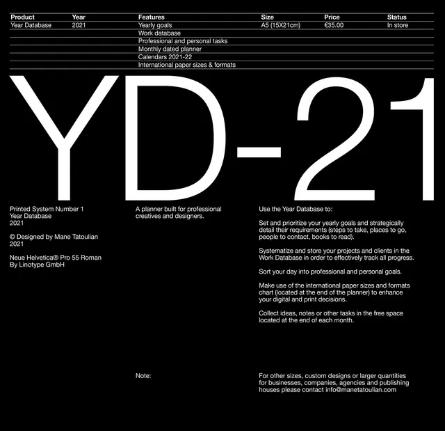
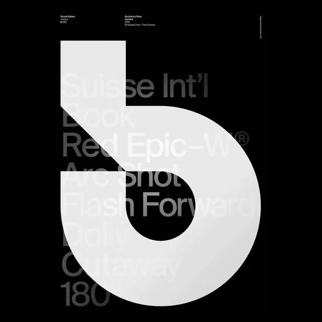
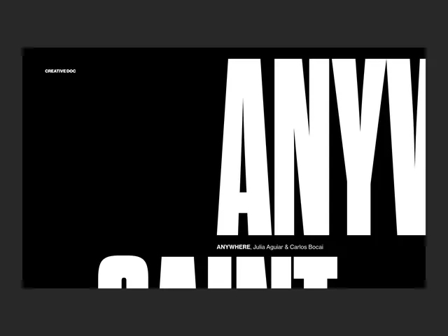
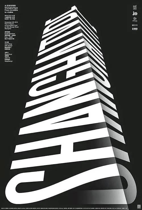
Combining outlined and solid versions of the same typeface creates visual interest and hierarchy without introducing multiple typefaces. Varying scale and weight draws the eye through the poster while maintaining unity. Monochromatic approach focuses attention on typography itself as the primary design element.
Reuse notes
Powerful template for cultural event posters, gallery announcements, or art-world communications where typography is the hero. Works well for festivals, exhibitions, and conferences targeting design-literate audiences. The outlined letter technique is particularly effective in small print sizes for contrast and readability on black. Scale variation can be pushed even further for maximum impact.