Preview image. Unlock full-res
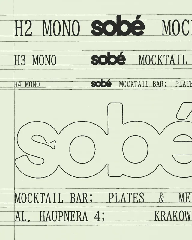
A typographic composition on pale paper combines oversized outlined letters with small monospaced labels and horizontal guide lines.

Summary
A typographic composition on pale paper combines oversized outlined letters with small monospaced labels and horizontal guide lines.
Visual description
The image shows a pale greenish paper background covered with thin horizontal guide lines and a few vertical margin lines. Across the top and middle are small type rows reading things like H2, H3, H4, MONO, and MOCKTAIL, plus a bold black wordmark-like form that reads "sobé" in different sizes. The lower half is dominated by an oversized outlined lowercase wordform cropped by the frame.
Key takeaway
Use a restrained typographic system with visible construction lines to make the layout feel like a working proof or specimen sheet. Combine one heavy display wordmark with smaller supporting labels for contrast and hierarchy.
Reuse notes
Best for identity studies, typography presentations, or editorial covers that need a raw process-driven feel. It works especially well when the goal is to make lettering feel engineered rather than polished.
More like this

Keep what you find
A free account saves references to boards and can send you a weekly email of picks based on what you save.
To see every result, go Pro.