Preview image. Unlock full-res
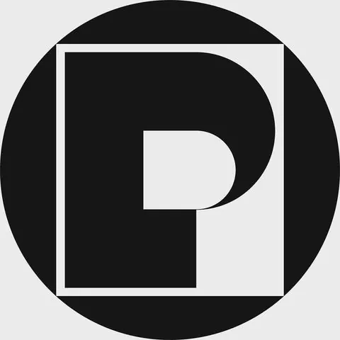
Modern geometric wordmark or logo featuring the letter P in a bold, minimal monochrome treatment with clean negative space.

Summary
A minimal geometric logo or wordmark centered on a large capital letter P with clean negative space, rendered in stark black and white with a circular framing device.
Visual description
Centered composition. Large geometric capital P rendered in bold black occupies the center-right of a square frame. The P is constructed from clean rectangles and curves — a vertical bar on the left, a rounded bulbous form on the upper right creating the bowl of the letter. The background is divided: left half is black, right half is white (creating a split or yin-yang dynamic). The entire composition sits within or is framed by a perfect circle that encompasses the black and white square below it. The circle is black on the outer edge, creating a badge-like or medallion appearance. Stark contrast, symmetrical, geometric precision, no gradients or textures.
Key takeaway
Masterful use of negative space and geometric simplification. The split black-white background adds sophistication and modern edge while remaining readable. The circular frame elevates the mark from simple letterform to a complete brand symbol. Symmetry and geometric precision communicate professionalism and modernity.
Reuse notes
Strong reference for corporate, tech, or luxury branding. The minimal geometric approach is timeless and scales well (from favicon to signage). Works well for creative, design, or professional services where sophistication is key. The monochrome palette ensures versatility across contexts. The split background treatment is distinctive and memorable — a unique branding decision worth borrowing.
More like this

Keep what you find
A free account saves references to boards and can send you a weekly email of picks based on what you save.
To see every result, go Pro.