Preview image. Unlock full-res
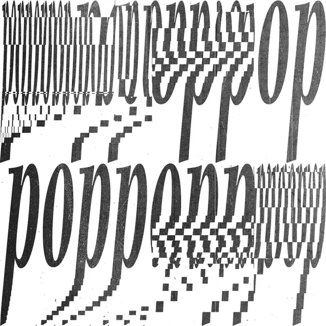
Bold black italic serif letterforms, doubled in two rows, break apart into a stuttering halftone/dither glitch pattern toward the left edge of a stark white square.
Summary
A square, black-and-white type experiment: bold italic serif letters appear twice, stacked in two rows, with the right-hand letterforms solid and intact while the left side stutters apart into a halftone dither pattern.
Visual description
On a plain white square canvas, large black italic serif characters with heavy bracketed serifs and rounded bowls sit in two horizontal rows, one upper and one lower. On the right side of each row the letterforms are whole, high-contrast black shapes with crisp edges. Moving left, the same letterforms repeat in narrowing vertical slices, each slightly offset, as if multiple exposures of the same letters were stacked and gradually desynchronized; the slices shrink into a scatter of small black halftone-style squares and dots that fade out toward the left edge. The overall effect reads like a glitch, dissolve, or stroboscopic motion-blur applied to type rather than a static logotype.
Key takeaway
A purely typographic dissolve/echo effect, driven by halftone dot decay rather than color or gradient, suggests motion or digital breakdown. Restricting the palette to pure black and white keeps the effect legible as an intentional type treatment rather than noise.
Reuse notes
Reference for expressive type treatments on posters, album art, or motion-graphics stills where a static logotype needs to imply speed, glitch, or decay. Because the source word is illegible in this crop, this works best as a texture/effect reference rather than for its (unknown) copy. Needs a high-contrast black-on-white base to read correctly.
More like this
Keep what you find
A free account saves references to boards and can send you a weekly email of picks based on what you save.
To see every result, go Pro.