Preview image. Unlock full-res
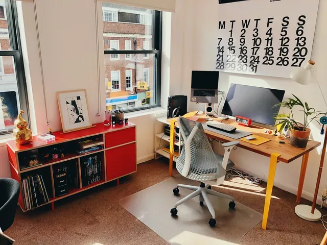
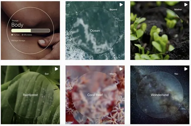
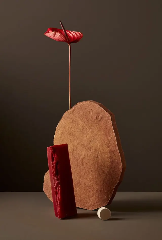
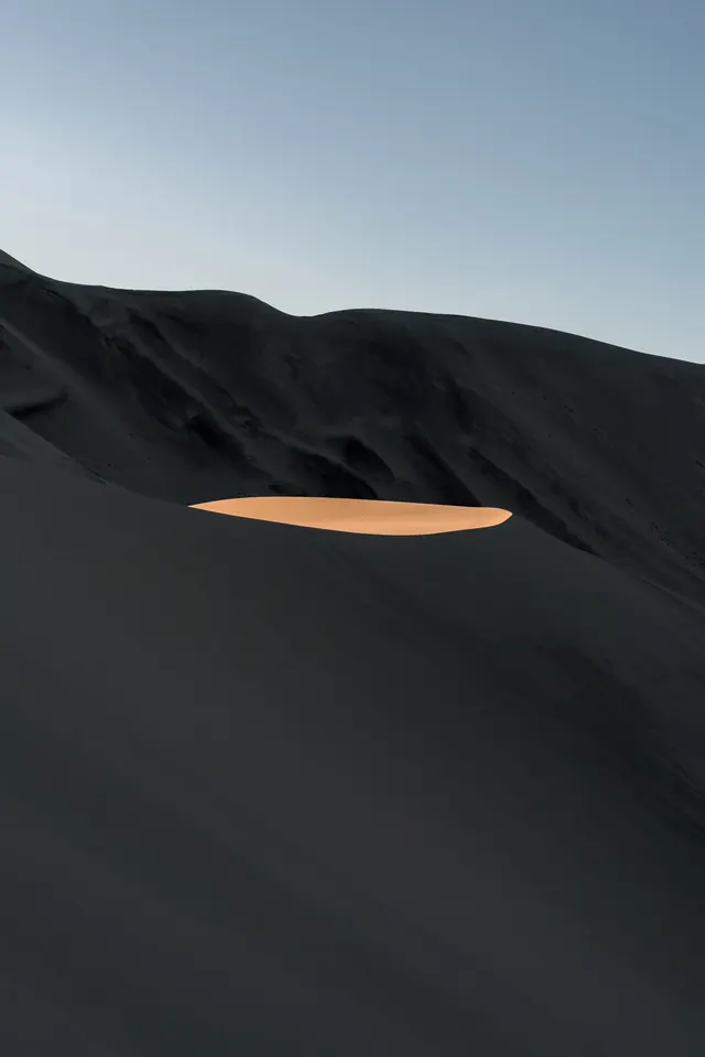
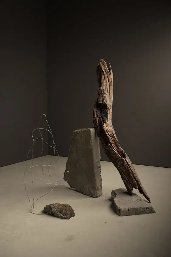
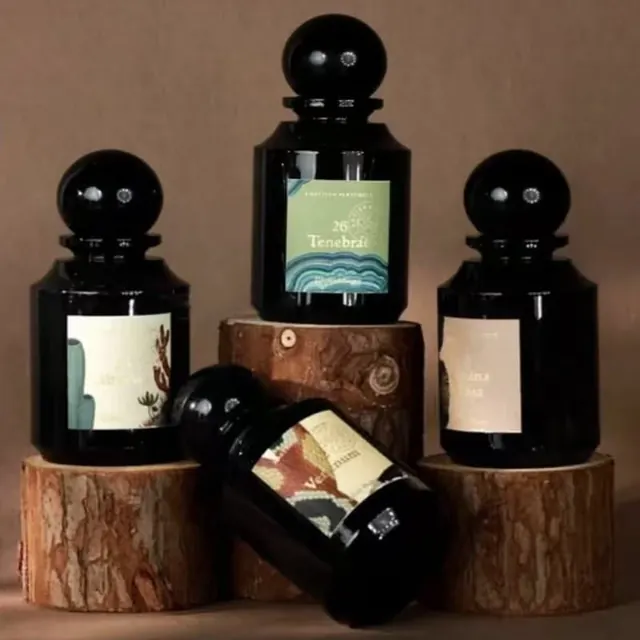
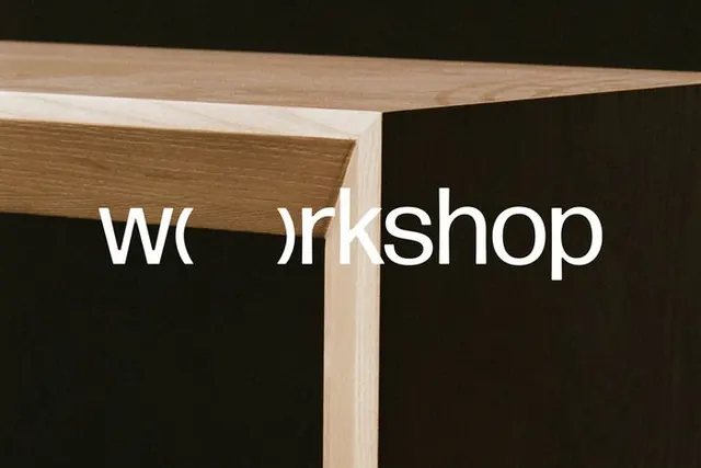
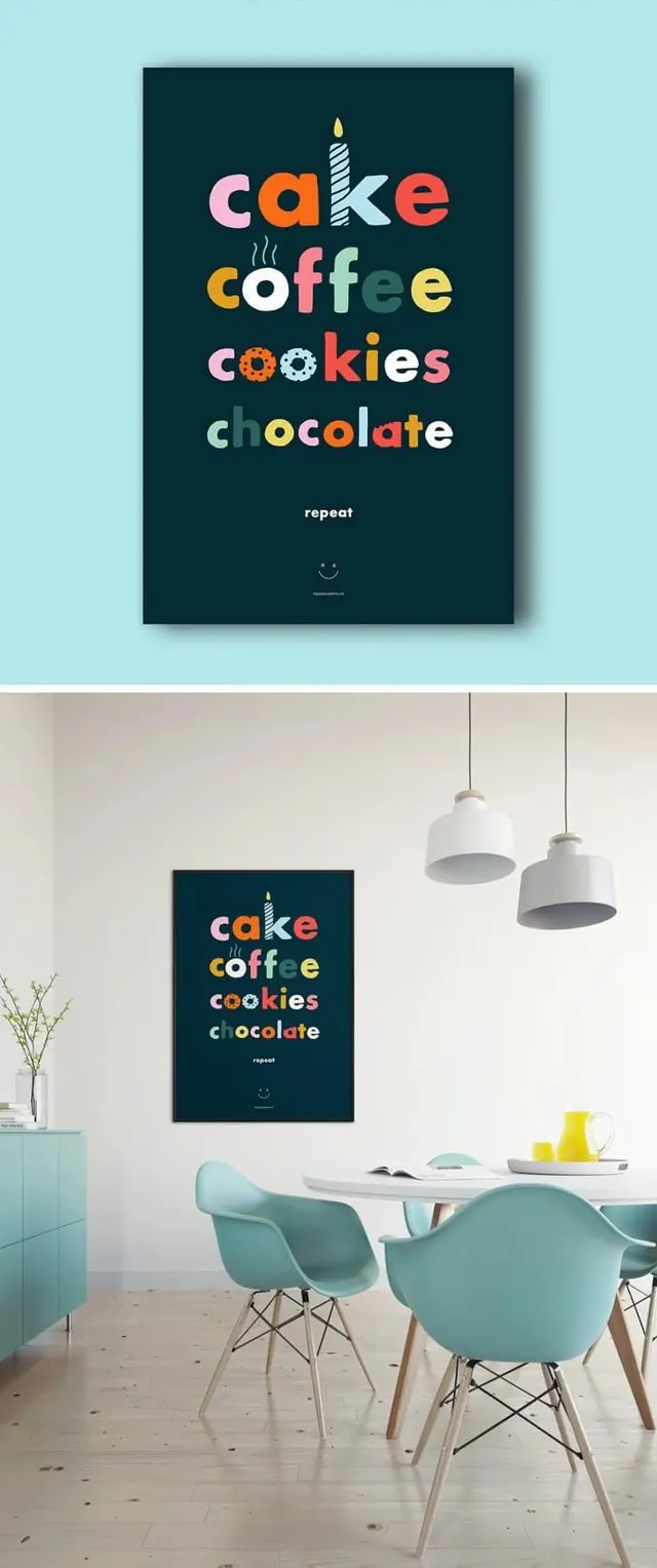
Sophisticated color palette combining warm grays, navy, and warm deep red, creating layered visual depth through restrained yet rich tones.
Summary
A subtle, sophisticated color composition balancing warm beige-gray with cool navy and a restrained warm red accent, creating elegant restraint.
Visual description
Three primary colors work in concert: warm, muted beige-gray (#CCC7C0) as the dominant field, deep navy blue (#1C2F47) providing cool contrast, and a warm, muted deep red (#941E20) as a fine accent. The palette is notably restrained—no primary or bright hues, all colors slightly desaturated, creating a cohesive, sophisticated mood. Likely geometric composition with careful color blocking.
Key takeaway
Shows how restraint with warm and cool tones creates elegance. Demonstrates that sophisticated color use doesn't require brightness or saturation, just thoughtful relationships between hues.
Reuse notes
Excellent reference for luxury branding, editorial work, and sophisticated design systems. Works well for upmarket products, premium services, or any application requiring understated elegance. Pairs well with minimal geometry and clean typography.