Preview image. Unlock full-res
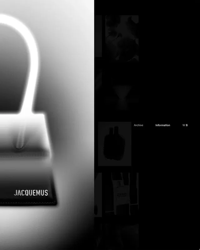
A split-screen composition showing a minimalist curved white product on the left and a dark website interface on the right, unified by clean typography and monochrome palette.

Summary
A premium brand presentation that bridges product and digital presence: a luxury item displayed on one half, its website ecosystem on the other, unified through monochromatic restraint.
Visual description
The left side shows a minimalist white sculptural object (likely a bag or accessory) with organic curves against a neutral background. The right side displays a dark website interface with "Archive," "Information," "W B" navigation text, product thumbnails, and layout grids. The two halves are equal in visual weight despite different content types. The overall palette stays tightly grayscale with subtle value shifts.
Key takeaway
Demonstrates sophisticated brand communication: the split format shows product and digital experience as equally important. The monochrome treatment makes both feel premium and intentional. The composition suggests a system of visual thinking, not isolated assets.
Reuse notes
Reference for luxury brand presentation, product mockups, or integrated marketing materials. The balance between physical product and digital space is particularly useful for brands selling both direct-to-consumer and online. Study how restraint in color and complexity enhances perceived value.
More like this




Keep what you find
A free account saves references to boards and can send you a weekly email of picks based on what you save.
To see every result, go Pro.