Preview image. Unlock full-res
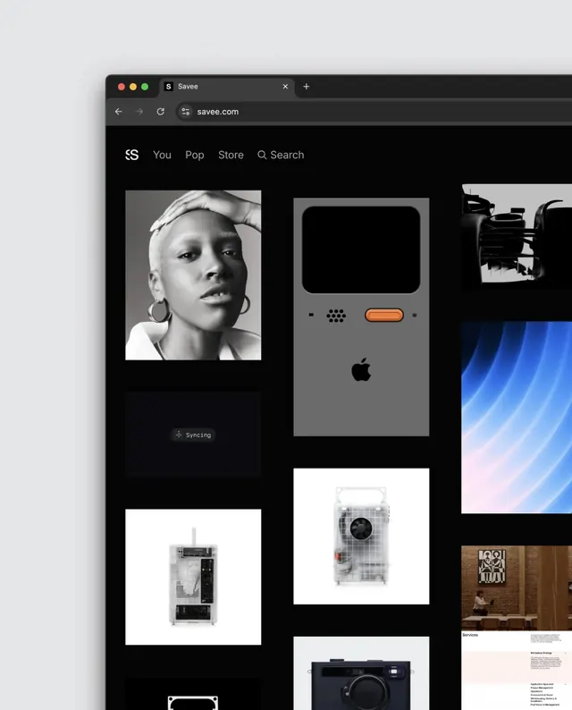
Screenshot of a dark-themed design portfolio website featuring a navigational header and grid layout of curated project images spanning photography, mockups, and digital work.
Summary
A digital screenshot of a minimalist design portfolio interface rendered in dark theme, showing a navigation bar and a masonry grid of project thumbnails spanning portrait photography, product mockups, landscapes, and digital assets.
Visual description
A dark background (near black) hosts a small navigation header with logo and menu items in light gray. Below, a loose masonry grid displays roughly 9-12 image thumbnails of varying sizes. The images include a monochrome portrait, green foliage, a figure in white, product photography, a white sneaker, a snowy landscape, intimate textiles, architectural or digital mockups, and food or organic close-ups. Each thumbnail sits in its own white or light frame against the dark background, creating separation and visual rhythm. Text labels or project names appear beneath some thumbnails. The overall approach emphasizes image quality and curation over decorative elements.
Key takeaway
Dark interfaces elevate image-focused content by providing high contrast and reducing visual noise. A simple grid structure lets strong photography dominate while navigation remains subtle and accessible.
Reuse notes
Excellent reference for portfolio websites, design agency sites, or image-heavy applications. The dark background approach works for contemporary, luxury, or creative-focused brands. The grid layout scales well across device sizes when designed with a modern responsive framework. Works best when the curated images themselves are the main attraction.
More like this
Keep what you find
A free account saves references to boards and can send you a weekly email of picks based on what you save.
To see every result, go Pro.