Preview image. Unlock full-res
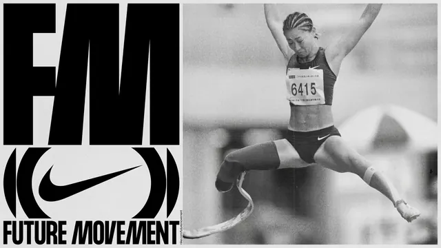
Split-screen branding composition combining bold typography on the left with dynamic sports photography on the right, unified by strict black and white color palette and a recognizable swoosh mark.
Summary
A bold split-screen campaign layout positioning oversized typography and brand marks on a black left section against dynamic black-and-white athlete photography on the right, creating visual and conceptual balance between brand and performance.
Visual description
Left side: solid black background with large white condensed sans-serif type (all-caps, tight spacing) reading vertically or diagonally. Below, a prominent athletic brand mark in white. Right side: black-and-white photograph of an athlete in mid-motion, captured in dramatic light. The composition uses strong geometric contrast: sharp text shapes against organic human movement, stable typography against dynamic pose. The strict monochrome palette unifies both halves despite the visual tension between them.
Key takeaway
The split composition technique creates energy through compositional contrast while maintaining brand coherence through color discipline. The typography and mark are strong enough to share screen space with powerful photography.
Reuse notes
Excellent for athletic brands, sports campaigns, or performance-focused messaging. The black-and-white treatment gives credibility and timelessness. Works well for campaign launches, product features, or documentary-style brand content. The split layout can be adapted horizontally or vertically. Best when the photograph and typography reinforce the same narrative.
More like this


Keep what you find
A free account saves references to boards and can send you a weekly email of picks based on what you save.
To see every result, go Pro.