Preview image. Unlock full-res
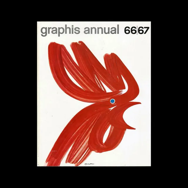
An abstract illustration or design piece blending dark brown and tan tones with cool blue accents in a gradient composition.
Summary
An earthy abstract composition that balances warm, natural brown and tan tones with cooler blue accents, creating visual tension and depth through organic color blending.
Visual description
The palette is anchored by a dark warm brown (59%) serving as the base, complemented by a lighter tan-brown (28%) that creates a natural, earthy feel. The composition introduces contrast through a cool blue tone (11%), which provides visual relief and sophistication. A deeper, rich brown (1%) adds additional depth. The abstract nature suggests flowing, organic shapes or gradient transitions between these tones.
Key takeaway
The strategic juxtaposition of warm earthy tones with a cool blue accent creates dynamic balance in an otherwise warm composition. This warm-cool contrast technique prevents the palette from feeling flat while maintaining harmony through the earthy base tones.
Reuse notes
Suitable for organic, natural-product branding, wellness content, and artistic design applications. The warm-earthy base works well for earthiness and trust, while the blue accent provides sophistication and calm. The gradient approach is effective for digital backgrounds, decorative elements, or any design seeking an organic yet refined aesthetic. Works particularly well for earth-conscious or natural-product brands.