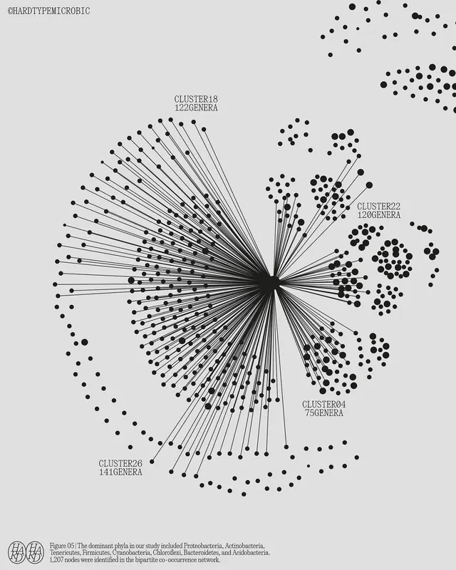
Preview image. Unlock full-res
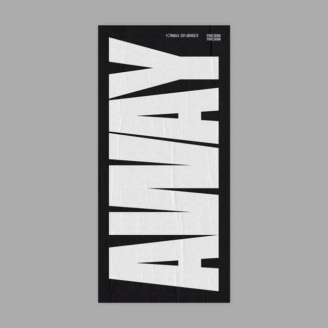
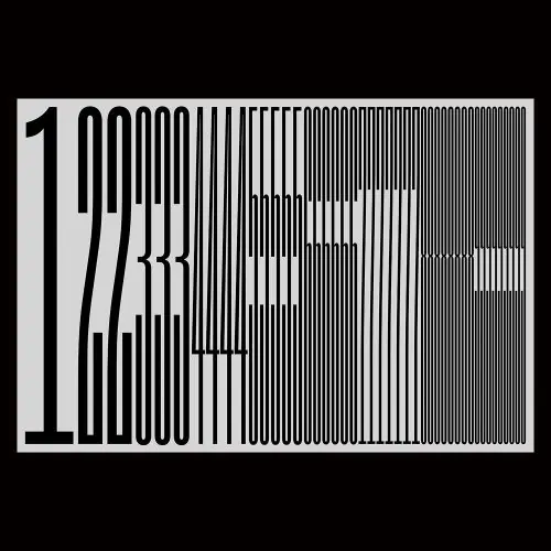
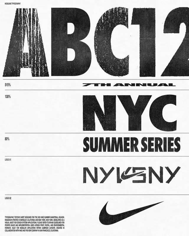
A portrait-oriented grayscale study with high contrast between light grays and near-black, emphasizing stark visual clarity.

Summary
A stark grayscale composition using only light gray and near-black, creating maximum contrast and visual impact through a pure achromatic palette.
Visual description
The composition operates in strict grayscale: light gray (#E0E0E0), mid-gray (#7D7D7C), and deep charcoal (#3D3D3C). The absence of any color information focuses attention entirely on form, contrast, and value relationships. The high-contrast approach creates bold, unambiguous visual hierarchy.
Key takeaway
Removing all color information strips away distraction and forces focus on fundamental design principles: contrast, form, and hierarchy. The stark grayscale palette demonstrates clarity through constraint.
Reuse notes
Excellent for type specimens, technical documentation, and high-clarity design systems. Works well in minimalist and contemporary design contexts. Pairs effectively with strong geometric compositions. Less suitable for warm, organic, or humanistic design needs.
More like this
Keep what you find
A free account saves references to boards and can send you a weekly email of picks based on what you save.
To see every result, go Pro.