Preview image. Unlock full-res
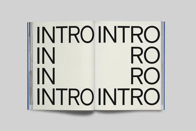
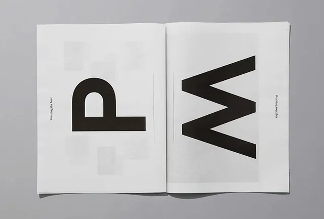
An open catalog spread featuring large repetitive sans-serif typography of the word "INTRO" arranged in multiple lines across left and right pages on a cream background.
Summary
A minimalist editorial spread from the 2024 Dsgnselo catalog showing large-scale repetitive typography of the word "INTRO" arranged across an open book against a neutral cream background.
Visual description
An open magazine or catalog spread occupies the composition. Both pages feature a cream or light gray background with the word "INTRO" repeated and arranged across the pages in a large sans-serif typeface in dark gray or black. The text is arranged in multiple rows and in a cascading or flowing pattern that moves from left page to right page. The typography is bold and geometric, with consistent sizing that creates a rhythmic, grid-like composition. Blue accent bands or structural lines appear on the outer edges of the pages. The overall design is extremely minimal with no other imagery or decorative elements.
Key takeaway
Typographic repetition and scale create visual interest without relying on color or imagery. The arrangement balances symmetry and asymmetry to create dynamic negative space.
Reuse notes
Strong reference for editorial and catalog design, especially for minimalist luxury brands. The technique of repeating text at scale is effective for section dividers or intro pages. Works well for design publications, fashion catalogs, and corporate communications emphasizing simplicity and clarity.
More like this


Keep what you find
A free account saves references to boards and can send you a weekly email of picks based on what you save.
To see every result, go Pro.