Preview image. Unlock full-res
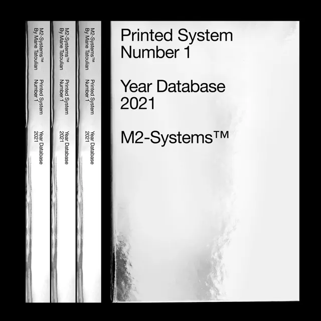
Square composition showing three printed binder spines stacked vertically on the left with their front cover material on the right.
Summary
Clean, systematic presentation of a bound printed series (M2-Systems Year Database 2021), showing three spine-out binders arranged with one opened cover, using strict typography and monochromatic design.
Visual description
The square composition divides into two equal halves: the left side shows three identical binder spines standing vertically, bound in white with black text reading vertically (serif font, "M2 Systems", "By Mane Tatoulian", "Printed System", "Year Database 2021"). The right side displays the opened cover and interior page, featuring a white background with bold black sans-serif headline text reading "Printed System Number 1" and "Year Database 2021" and "M2-Systems™" in varying scales. The typography is clean and hierarchical. The overall contrast is stark black and white with minimal grayscale variation.
Key takeaway
The power of systematic design and restrained typography to communicate professionalism and organized information. The split composition—spines and spread—efficiently documents both the bound and open states.
Reuse notes
Strong reference for editorial design, catalogue systems, or institutional identity. The tight monochromatic palette and serif/sans-serif pairing model typography decisions for serious, data-driven publications.
More like this


Keep what you find
A free account saves references to boards and can send you a weekly email of picks based on what you save.
To see every result, go Pro.