Preview image. Unlock full-res
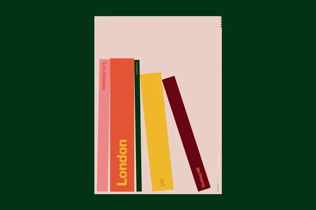
Poster design depicting leaning book spines in vibrant complementary colors against soft pink background, with tilted geometric composition.
Summary
A geometric poster design showcasing five leaning book spines in bold complementary colors, titled with event names in minimal sans-serif typography.
Visual description
Against a soft pale-pink background, five vertical rectangular book spines tilt at varying angles, as if falling or arranged casually. Colors are distinct and vibrant: soft pink, warm orange-red, forest green, bright yellow, and deep burgundy. Each spine is labeled with text: "San Angeles" (pink), "London" (orange with yellow text), "Best of" (green), "142" (yellow), and "Netting Print" (burgundy). The composition feels dynamic and slightly off-balance through the tilted angles. Typography is clean and utilitarian, allowing the color composition to dominate.
Key takeaway
Color as the primary design element. By using bold complementary hues and tilted geometry, a simple concept (books on a shelf) becomes visually striking and memorable. The soft background prevents the design from feeling chaotic.
Reuse notes
Strong reference for book publishing, literary event posters, or design conference materials. Works as a gallery wall poster. The tilted perspective adds motion and interest to an otherwise static subject. Could adapt to other linear objects: vinyl records, art supplies, architectural elements. The color palette feels contemporary and design-forward. Would suit both print and digital applications.
More like this
Keep what you find
A free account saves references to boards and can send you a weekly email of picks based on what you save.
To see every result, go Pro.