Preview image. Unlock full-res
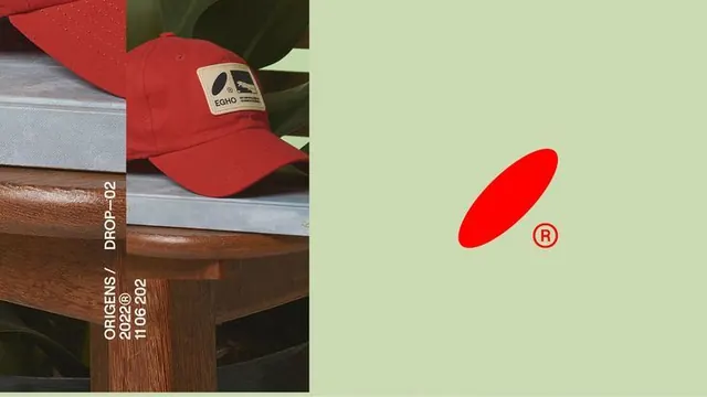
A two-part product layout featuring a red baseball cap and branded wooden accessory on the left, paired with a bold red geometric shape and logo on a soft lime-green background on the right.
Summary
A two-part product layout featuring a red baseball cap and branded wooden accessory on the left, paired with a bold red geometric shape and logo on a soft lime-green background on the right.
Visual description
A diptych composition split 50/50. Left panel shows overhead-angled product photography: a deep red baseball cap with a small rectangular branded badge, resting on a natural wood log or block printed with white text reading "ECHO" and dates. Right panel is a flat, pastel lime-green field with a large red elliptical shape and a small registered-trademark symbol (red circle with R) near the center. The red of the cap and the red of the geometric shape are identical hue, creating visual continuity across the split. White typography on the wood and the small R symbol provide minimal punctuation.
Key takeaway
The complementary color pairing of red against soft lime-green is bold but not jarring, kept calm by the pastel saturation of the green. Splitting product/physical assets on one side with flat graphic branding on the other creates a modern "physical plus brand" visual system. The geometric shape (ellipse) echoes the cap's form language without being literal.
Reuse notes
Excellent for apparel or accessories brands establishing product + identity pairings. The diptych layout works well for catalogs, lookbooks, or social-media tile compositions. Best when you have a clean, recognizable product with strong silhouette and a bold-but-simple logo mark. The complementary color story needs restraint elsewhere or it will feel garish; works because the green is muted/pastel.
More like this


Keep what you find
A free account saves references to boards and can send you a weekly email of picks based on what you save.
To see every result, go Pro.