Preview image. Unlock full-res
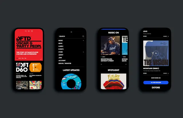
Four dark-mode mobile app mockups for an electronic-music label showing a home feed, navigation menu, artist spotlight, and release list.
Summary
Four smartphone mockups laid side by side, showing the home feed, navigation drawer, an artist spotlight screen, and a release list for a dark-mode electronic-music-label app.
Visual description
Each phone frame sits on a flat dark grey background. The first screen opens on a bright red hero banner with bold black stacked headline type, a numbered carousel indicator, and release tiles below. The second screen is a full-screen black navigation menu with a list of nav items (Music, News, Labels, Events, Store, About) in white all-caps type, plus a "Latest Updates" section with a colorful vinyl-record graphic. The third screen shows a "Music On" spotlight section with an artist photo, colored category dots, and a "Spotlight" release card featuring bold lettering over lipstick-red lips artwork. The fourth screen is a "Love" release page with dark background, a striped-pattern album cover, a play button, track credits, and a blue "All New Releases" pill button.
Key takeaway
A dark UI base lets each screen use one saturated accent color (red hero, blue play button, colorful record art) to keep the app feeling vibrant and music-driven without competing with the interface chrome.
Reuse notes
Good reference for music, media, or entertainment app UI, especially dark-mode designs that need bold accent moments against black backgrounds. The four-phone mockup layout works well for a portfolio case study or an app-store style showcase.
More like this
Keep what you find
A free account saves references to boards and can send you a weekly email of picks based on what you save.
To see every result, go Pro.