Preview image. Unlock full-res
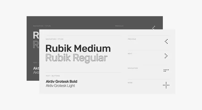
Clean light UI mockup displaying Rubik Medium, Rubik Regular, Aktiv Grotesk Bold and Light font samples with navigation labels.
Summary
Clean light UI mockup displaying Rubik Medium, Rubik Regular, Aktiv Grotesk Bold and Light font samples with navigation labels.
Visual description
Two layered panels on a light off-white background. A dark gray sidebar on the left shows large outlined "R" letters and vertical labels reading "NAVIGATION + TITLES", "TEXT +", "Aktiv Grotesk Bold", "Aktiv Grotesk Light". A white foreground card displays large "Rubik Medium" and "Rubik Regular" headlines, followed by smaller labels "NAVIGATION + TITLES", "TEXT + BUTTONS", "Aktiv Grotesk Bold", "Aktiv Grotesk Light", and right-aligned UI elements: "PREVIOUS", "NEXT", three-dot menus, and plus icons. Subtle shadows and clean spacing.
Key takeaway
The overlay of a dark type panel behind a light content card demonstrates font hierarchy and pairing with clear label hierarchy in a minimal interface.
Reuse notes
Useful for typography sections, design system docs, or font showcase UIs. Light background with gray accents works for clean documentation or settings panels. The dot and arrow UI elements provide subtle interaction cues without clutter.
More like this
Keep what you find
A free account saves references to boards and can send you a weekly email of picks based on what you save.
To see every result, go Pro.