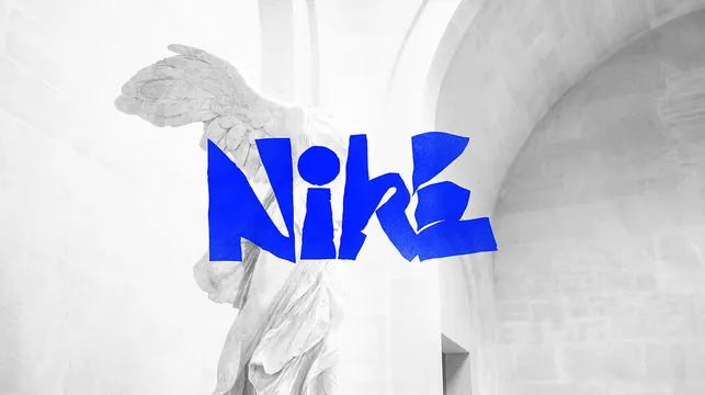
Preview image. Unlock full-res
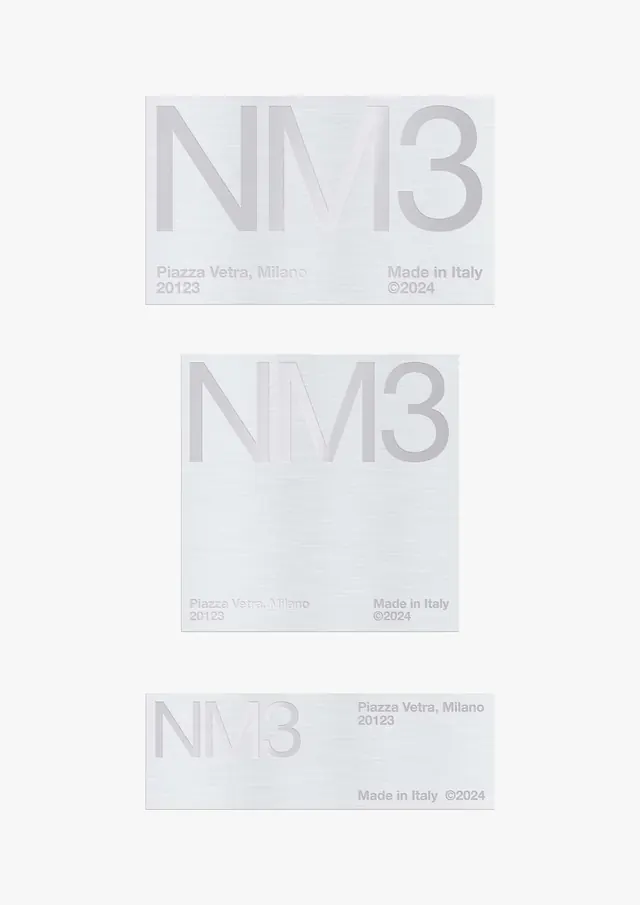
A clean, minimal typographic composition rendered in near-white tones with subtle gray accents, emphasizing space and elegant font hierarchy.
Summary
A refined typographic study showcasing clean sans-serif typography in white and light gray tones with careful attention to spacing and hierarchy.
Visual description
The composition uses a monochrome palette of off-white (#f6f6f6) and very light gray accents to display typographic forms and layout structure. The wide landscape format (1200x672) provides ample horizontal breathing room for the typography to shine. The design demonstrates principles of Swiss style typography with its emphasis on minimal embellishment, generous whitespace, and clear visual hierarchy. The sans-serif typeface appears in varying weights and scales to establish compositional rhythm.
Key takeaway
Extreme restraint and the use of subtle gray variations to create depth in a monochrome design; how good typography and spacing can command attention without color or imagery.
Reuse notes
Excellent for minimal branding, editorial typography showcases, design systems, or luxury brand contexts. The light palette suggests sophistication and cleanliness. Works best on white or light gray backgrounds. Can serve as a reference for typographic hierarchy or as a template for minimal layouts. The subtlety means it pairs well with imagery or color when layered on top.
More like this



Keep what you find
A free account saves references to boards and can send you a weekly email of picks based on what you save.
To see every result, go Pro.