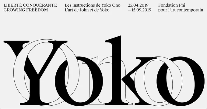
Preview image. Unlock full-res
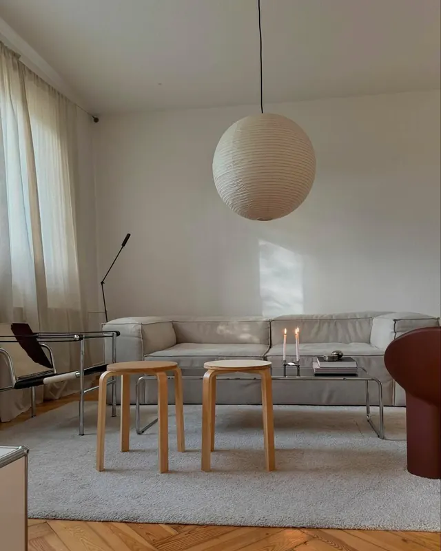
A light, neutral horizontal composition with warm beige and cream tones creating an open, spacious feeling.
Summary
A light, warm-neutral horizontal composition with subtle gradations creating an open, serene atmosphere.
Visual description
Dominated by light cream and beige tones arranged in a wide, horizontal format emphasizing spaciousness. The tonal variations are gentle and organic, creating subtle depth without harsh contrasts. The horizontal orientation suggests calm, stability, and expansiveness. The overall palette remains warm and inviting while maintaining minimalist restraint.
Key takeaway
Horizontal formats combined with light palettes naturally evoke calm and openness. This composition style works well for hero sections and expansive backgrounds.
Reuse notes
Perfect for landscape hero sections, travel and lifestyle branding, or editorial spreads. The horizontal format works well for widescreen digital designs and panoramic print applications. Suggests wellness, nature, and space. Excellent for home, hospitality, and luxury goods contexts. Works as a sophisticated background for hero sections and full-bleed layouts.
More like this

Keep what you find
A free account saves references to boards and can send you a weekly email of picks based on what you save.
To see every result, go Pro.