Preview image. Unlock full-res
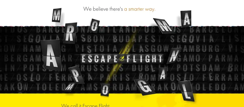
A bold typographic design with 'ESCAPE FLIGHT' headline overlaid on repeating city names and geometric elements.
Summary
A travel-themed poster with the headline "ESCAPE FLIGHT" set in large bold sans-serif type, layered over a background of repeating city names in smaller text. A bright yellow diagonal accent line cuts across the composition.
Visual description
Dark charcoal to black background with white condensed sans-serif type reading "ESCAPE FLIGHT" distributed across the composition in an angular, dynamic arrangement. Behind this headline, barely visible city names repeat in all-caps: Barcelona, Budapest, Paris, Lisbon, and others, creating a dense typographic texture. A bright neon yellow diagonal line runs from lower-left toward upper-right, creating directional energy. The top has a tagline "We believe there's a smarter way" in smaller type. The overall effect is urgency and movement—the asymmetrical letter placement and single accent color prevent it from feeling static.
Key takeaway
Repeating background text adds information depth without requiring additional visual elements. The single bright accent color (yellow) becomes a vector that guides the eye and conveys forward motion, making the entire composition feel directional and active.
Reuse notes
Strong reference for travel, adventure, and tech brands. Works equally well for event posters, music releases, or any category needing to communicate energy and destination-oriented messaging. The typography-first approach means minimal imagery is needed. Color could swap easily to red or green while maintaining impact.
More like this

Keep what you find
A free account saves references to boards and can send you a weekly email of picks based on what you save.
To see every result, go Pro.