Preview image. Unlock full-res
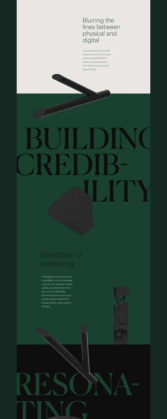
A balanced composition split between light cream tones and deep black, exploring maximum contrast within a centered square-ish format.
Summary
A bold, high-contrast composition balancing light cream and pure black tones in a centered arrangement, emphasizing dramatic contrast.
Visual description
A composition split or balanced between nearly white/cream tones (#FAF0F0) and deep black (#000A0A), creating maximum visual contrast. The arrangement appears somewhat centered or symmetrical, possibly with both colors occupying roughly equal space. The transition between light and dark may be sharp or gradual. No texture, pattern, or additional detail—purely compositional and tonal. The contrast is striking and immediately attention-grabbing.
Key takeaway
Drama and clarity through maximum contrast. The pairing of light and dark without intermediary tones creates bold, high-impact visual communication. This is a foundational principle in graphic design—used to guide eye movement and create focal points.
Reuse notes
Strong for posters, editorial layouts, or graphic design systems. Excellent for creating visual hierarchy and directing attention. Works well as a background for typography or imagery layered on top. Adapts to brand systems where contrast is a core value. Consider for publishing, art direction, or premium brand contexts seeking boldness and clarity.
More like this





Keep what you find
A free account saves references to boards and can send you a weekly email of picks based on what you save.
To see every result, go Pro.