Preview image. Unlock full-res
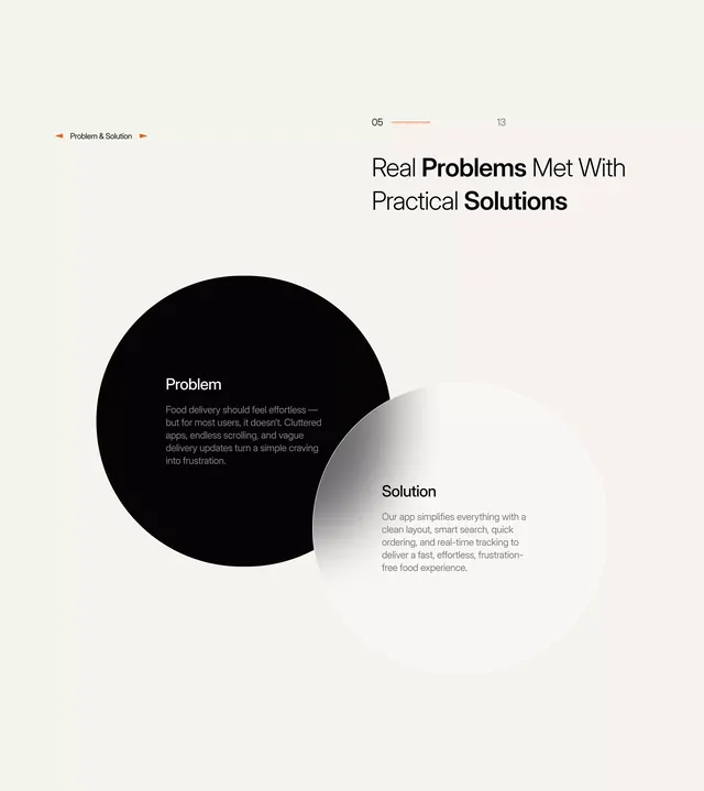
Two overlapping circles frame a problem statement and solution statement, with text reading 'Real Problems Met With Practical Solutions' anchoring the composition.
Summary
Two overlapping circles frame a problem statement and solution statement, with text reading "Real Problems Met With Practical Solutions" anchoring the composition.
Visual description
A large jet-black circle on the left contains white body text describing the problem; a light gray circle on the right overlaps it and holds a solution statement in dark text. The circles intersect, creating visual emphasis on their union. Above, a header section includes a small section label "Problem & Solution" with orange accent lines, a step indicator "05 / 13", and the centered headline "Real Problems Met With Practical Solutions" in heavy sans-serif type, with "Problems" and "Solutions" in bolder weight. The background is a soft cream-white. Typography is clean, modern, and sans-serif throughout. The palette is strictly neutral: blacks, creams, and light grays with minimal orange accent marks.
Key takeaway
The overlapping circles as a visual device to unify two opposing concepts; the clear headline that states the value proposition in plain language; the asymmetric weight shift between the problem (enclosed, self-contained) and solution (open, light) circles creating an implicit hierarchy.
Reuse notes
Strong for pitch decks, case studies, or product-comparison layouts where you need to frame a before-and-after or problem-solution pair without narrative bloat. The black-circle-on-white background reads clearly in presentations and works on slides. The "05 / 13" counter implies this is mid-deck, useful for multi-slide explanations. Scale and adapt the circle sizes to fit your content; reuse the headline structure for other solution-driven sections.
More like this







Keep what you find
A free account saves references to boards and can send you a weekly email of picks based on what you save.
To see every result, go Pro.