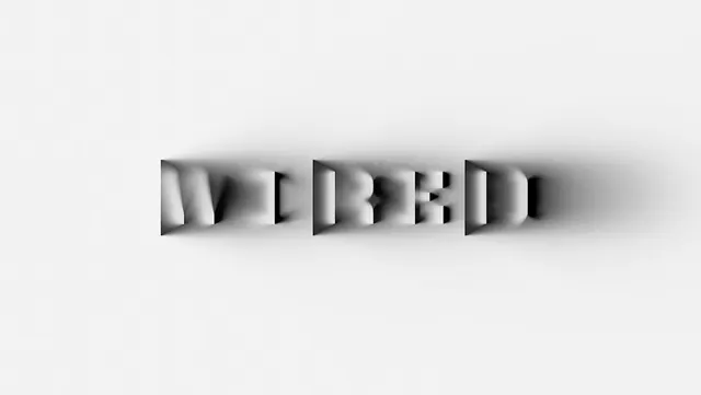
Preview image. Unlock full-res
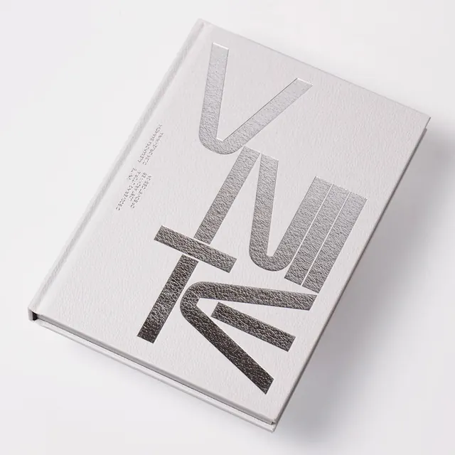
A minimalist grayscale composition in landscape format with very light (76%) and medium gray tones (20%), creating a subtle neutral palette study.
Summary
A landscape-format monochromatic grayscale study dominated by very light gray (76%) with medium and dark gray tones (20%) providing subtle contrast and definition.
Visual description
A minimalist composition rendered entirely in neutral grayscale. Very light, nearly off-white gray dominates the space, creating a calm, minimal ground. Medium gray and darker charcoal tones provide subtle definition, contrast, and visual structure, likely as geometric shapes or compositional divisions. The landscape aspect ratio and restraint suggest this is a design study, UI mockup, or graphic composition exploring tone and value relationships without color.
Key takeaway
Grayscale composition demonstrates how sophisticated design can be achieved through tonal variation alone. The subtle contrast between light and medium grays is effective without being dramatic—suitable for conveying calm and professionalism. This approach proves that complex visual hierarchy is possible without color.
Reuse notes
Excellent for design systems emphasizing neutrality, accessibility, and clarity. Strong for UI design, wireframing, or design prototypes. Perfect for professional, corporate, or tech-focused branding. Useful for applications requiring grayscale output or accessibility-first design. Works well for editorial design, especially for serious or contemplative content. Ideal for design education, portfolio documentation, or value studies. Consider for accessibility testing or high-contrast interface design. Suitable for architectural visualization, technical documentation, or minimal aesthetic applications. Strong foundation for accessible design systems.
More like this


Keep what you find
A free account saves references to boards and can send you a weekly email of picks based on what you save.
To see every result, go Pro.