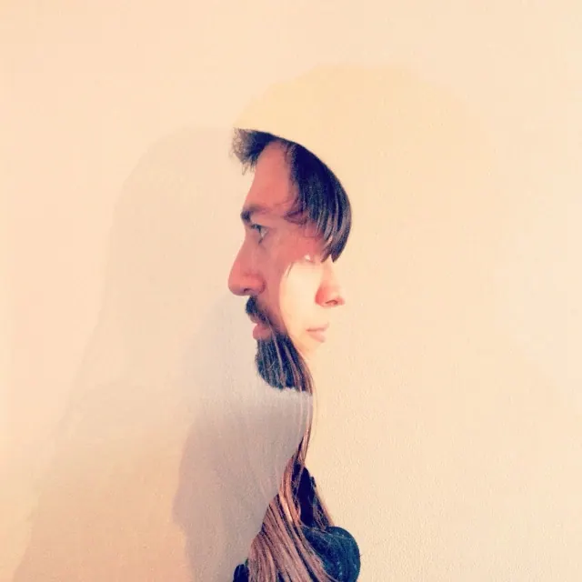
Preview image. Unlock full-res
A balanced color study at 1:1 square format exploring the contrast between warm peachy-beige and deep plum-purple tones.
Summary
A color study at square 1:1 aspect ratio exploring the dynamic contrast between warm peachy-beige (81%) and deep plum-purple tones, with a secondary muted mauve accent.
Visual description
A geometric square composition balancing warm and cool tones. Warm peachy-beige or cream occupies the dominant portion, creating a soft, inviting ground. Deep, dark plum-purple provides strong contrast and visual drama. A muted mauve or dusty rose tone bridges the warm-cool divide, creating sophistication. The composition is clean and geometric, likely with intentional color blocking or division suggesting UI design, graphic design, or color palette studies.
Key takeaway
The warm-cool contrast between peach and plum creates visual tension without discord. The addition of the tertiary mauve creates sophistication and contemporary appeal. This color combination balances warmth and richness with cool confidence.
Reuse notes
Strong for fashion, luxury brands, or contemporary design work emphasizing sophisticated color play. Excellent for UI design systems, especially applications targeting creative or fashion-focused audiences. Works well for beauty, cosmetics, or lifestyle branding. The peach-plum pairing is particularly effective for social media backgrounds, digital products, or editorial design. Easy to implement as a two or three-color system. Consider this palette for packaging, posters, or brand identity work seeking warmth with sophisticated edge.
More like this


Keep what you find
A free account saves references to boards and can send you a weekly email of picks based on what you save.
To see every result, go Pro.