Preview image. Unlock full-res
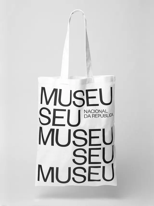
Minimalist vertical typography arrangement with varied font weights and sizes stacked on a cream background, exploring wordplay and poetic meaning.

Summary
Minimalist vertical typography composition with words stacked and rotated in varying condensed and italic weights on a cream background, creating a poetic, exploratory arrangement.
Visual description
A tall, narrow composition with words arranged vertically and at angles in black and grey sans-serif type on a cream background. Text includes condensed sans-serif in multiple weights, some italicized. The arrangement plays with scale and orientation—words like "the" appear large and centered while smaller, rotated words surround the composition. The overall effect is playful yet refined, resembling a concrete or visual poetry piece where meaning emerges from spatial relationships as much as the words themselves.
Key takeaway
Stacking words vertically and rotating them creates visual rhythm and invites multiple readings. Using mixed weights and condensed styles adds energy without requiring color changes. This approach transforms typography from decoration into conceptual art.
Reuse notes
Excellent for poetry collections, art book covers, or branding seeking intellectual, creative positioning. The technique works particularly well on social media for abstract, thought-provoking copy. Scale hierarchy and rotation should remain restrained—too much variation becomes chaotic rather than intentional. Works best with short, impactful phrases rather than long body copy.
More like this
Keep what you find
A free account saves references to boards and can send you a weekly email of picks based on what you save.
To see every result, go Pro.