Preview image. Unlock full-res
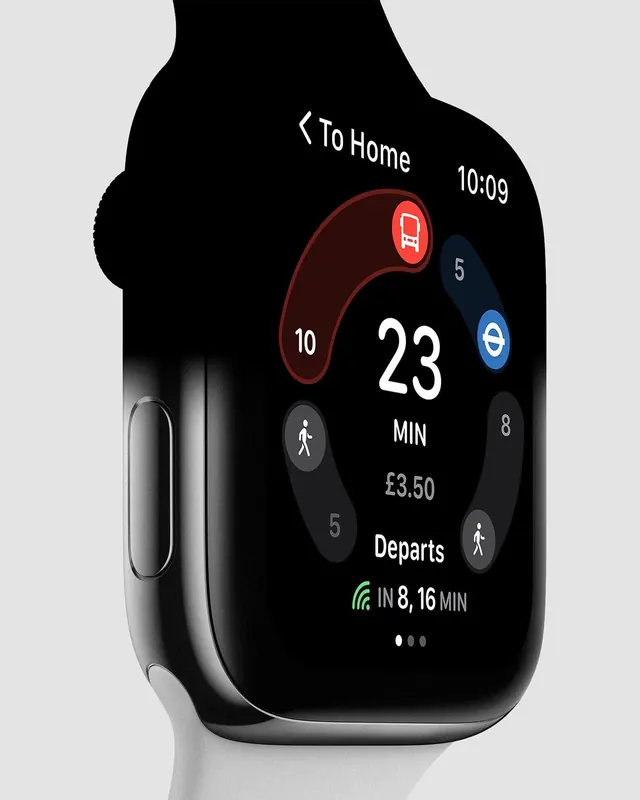
Apple Watch display mockup showing a transit app interface with journey details, departure time, and location data in a dark OLED design with accent red.

Summary
Apple Watch mockup displaying a transit journey planning interface showing time remaining (23 min), cost (£3.50), and departure details with red accent highlighting and dark OLED interface design.
Visual description
Wearable device mockup showing a smartwatch with a black rounded-rectangular screen. The interface displays white and grey text on pure black background. Central large white numbers "23 MIN" dominate the center. Supporting information includes journey steps (indicated by numbered circles: 10, 5, 8), a central play/walking icon, cost "£3.50", and "Departs" with "IN 8, 16 MIN" timing information. One element is highlighted in bright red (top right), drawing attention to an urgent action or alert. Bottom shows pagination dots. The entire design emphasizes readability on small screen with generous spacing and clear typographic hierarchy.
Key takeaway
Dark OLED interfaces on wearables use negative space and selective color accents (here, bright red) to guide attention without overwhelming. Large, easily-readable numerals for quick information glancing on wrist. Circular element placement mimics the watch face's natural focal point.
Reuse notes
Excellent reference for wearable app design, transit/navigation interfaces, and information-dense displays on small screens. The red accent for actionable elements is particularly effective on dark backgrounds. Demonstrates how to maintain visual hierarchy and scannability despite space constraints. Can inform health apps, fitness tracking, or any real-time information display.
More like this




Keep what you find
A free account saves references to boards and can send you a weekly email of picks based on what you save.
To see every result, go Pro.