
Preview image. Unlock full-res
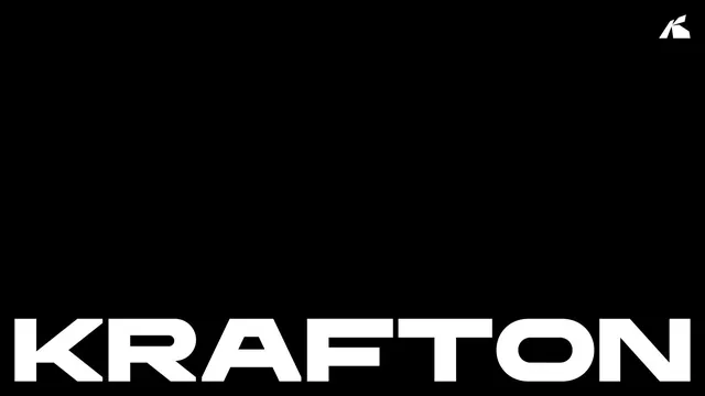
A high-contrast black, white and red brand guideline for game publisher KRAFTON, built on an extended condensed wordmark and an angular K logomark.
Summary
KRAFTON's basic brand guidelines, a tightly art-directed system in red, black and white for the Korean game publisher. The whole identity hangs on one extended condensed wordmark and a chiseled angular K logomark, presented across a disciplined grid.
Visual description
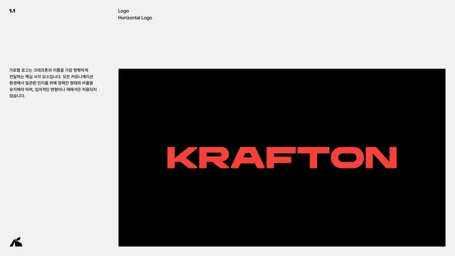
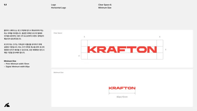
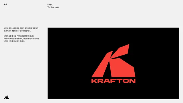
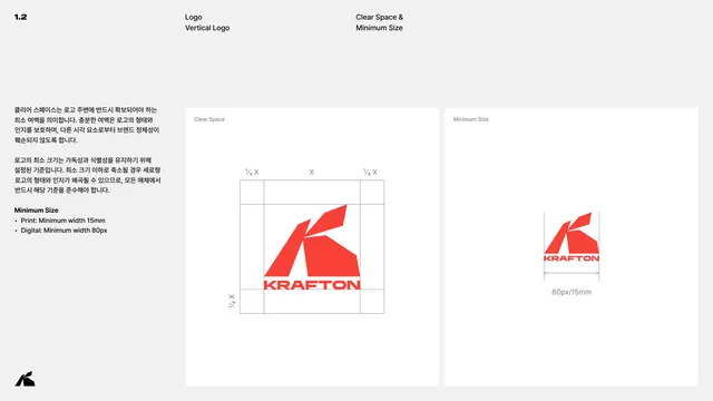
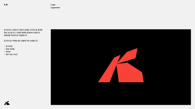
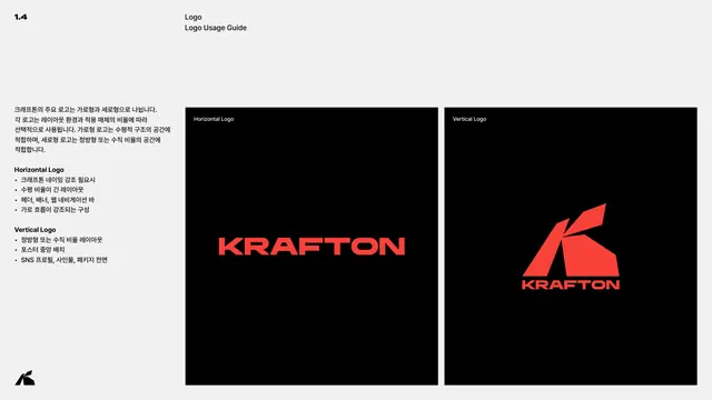
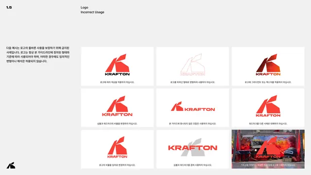
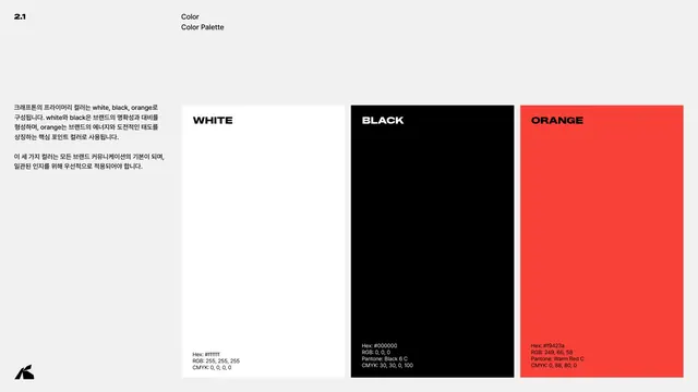
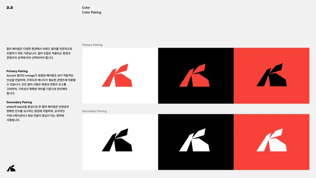
The deck runs on a strict three-color system: a warm red (#F9423A), pure black and white. Full-bleed red or black section dividers carry oversized black or white display headings (1.0 LOGO, 2.0 COLOR, 3.0 TYPOGRAPHY), while content pages sit on a light grey ground with a consistent header grammar: a numeric index top-left (1.1, 2.1, 3.1), a two-line section label, and a right-hand sub-label. A left text column in Korean explains each rule; the right side holds large black or red demonstration panels. The wordmark is a custom extended, condensed, all-caps sans (KRAFTON Headline) with squared terminals and a distinctive angled cut on the K and R legs. The logomark is a faceted, geometric K built from sharp polygon shards. A small white K-shard mark anchors the bottom-left corner of every content page. Layouts alternate between single large panels, side-by-side two-panel comparisons, and a nine-up incorrect-usage grid.
Key takeaway
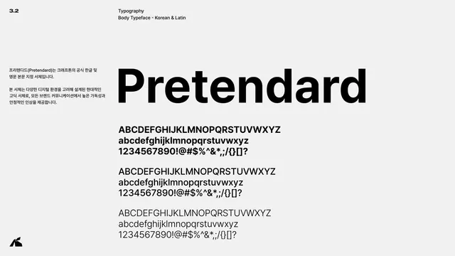
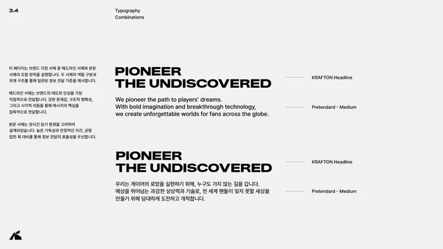
The relentless three-color discipline that makes red read as pure energy against black and white. The pairing of an aggressive custom display wordmark with a calm, neutral body face (Pretendard) so the brand voice lives entirely in the headline. The consistent page chrome, a numbered index, dual labels and a corner logomark, that makes a long document feel like one system.
Reuse notes
A strong reference for gaming, esports, entertainment tech and any bold challenger brand that wants high contrast and motion-like energy without using actual color variety. The angular, shard-based logomark and extended condensed type read as fast and aggressive, so it suits action and competitive contexts more than soft consumer ones. The section-divider-then-detail rhythm is a clean template for any multi-chapter guideline.
From this deck: KRAFTON Brand Guidelines (Basic V1.1)
View deck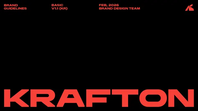







More like this







Keep what you find
A free account saves references to boards and can send you a weekly email of picks based on what you save.
To see every result, go Pro.