Preview image. Unlock full-res
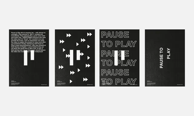
A series of four monochromatic poster variations exploring the phrase 'Pause to Play' with geometric play-button symbols and minimal typography.
Summary
A suite of four monochromatic posters exploring the interplay between pause and play, using repetitive geometric play-arrow symbols and centered typography to suggest motion and rhythm.
Visual description
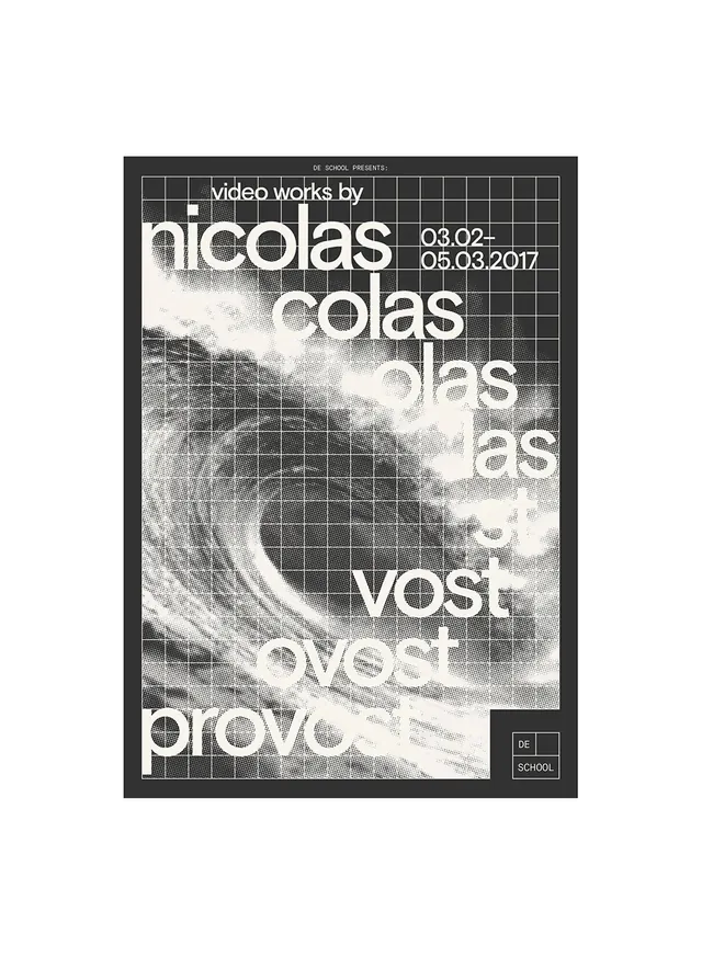
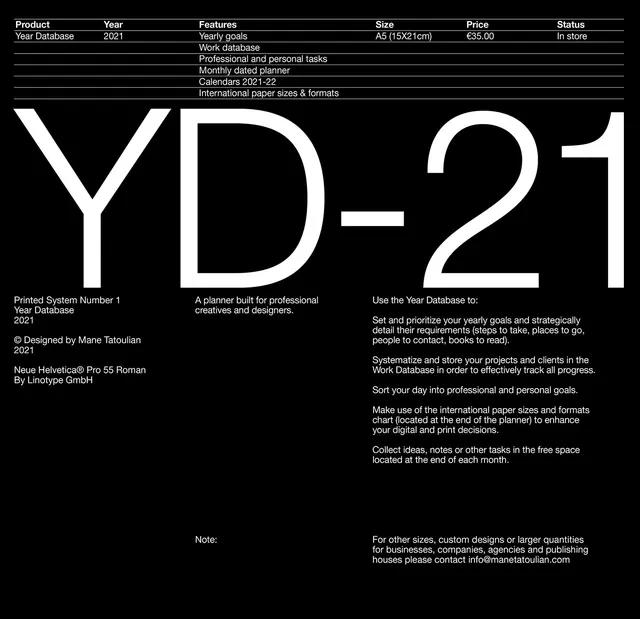
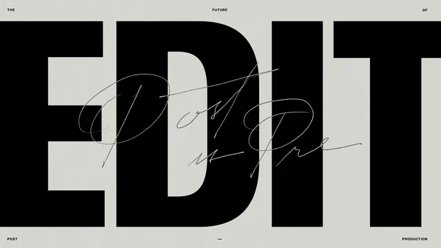
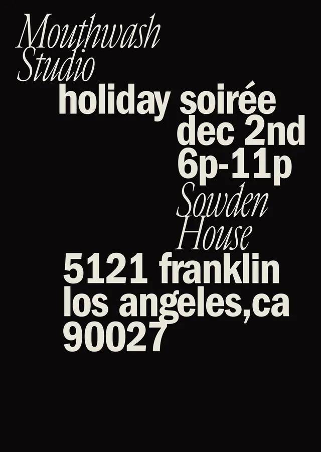
Four square poster compositions, each on a dark background. Each explores typographic and geometric variations: one features "Pause to Play" repeated three times in outlined sans-serif; another centers dense play-arrow symbols (>>) in a grid pattern; a third stacks "PAUSE / TO / PLAY" vertically; the fourth rotates the text vertically as "PAUSE ⊷ PLAY." All use white typography and symbols against dark backgrounds. Consistent spacing and alignment create a systematic, modular quality. Play arrows become a visual motif, reinforcing the conceptual theme through repetition.
Key takeaway
Typography as conceptual device—the form of the text echoes its meaning. Repetition of geometric symbols (play arrows) becomes both visual and conceptual reinforcement. Modular, systematic approach to a thematic series maintains coherence while exploring multiple expressions of a single idea.
Reuse notes
Strong model for thematic poster series or campaign suites where a single concept needs multiple visual iterations. The play-arrow motif could be swapped for other symbols depending on content. Effective for music, media, app, or technology contexts. The minimalist monochromatic approach ensures versatility—works well in both digital and print contexts.