Preview image. Unlock full-res
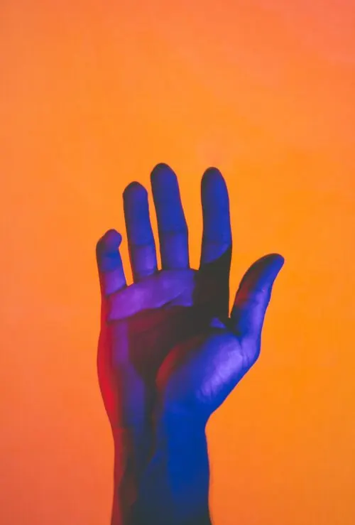
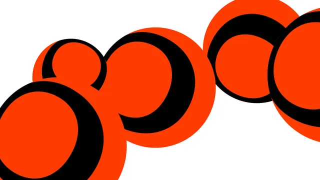
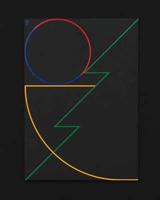
Bold graphic or pattern design in complementary orange and purple palette.
Summary
Striking graphic design using complementary colors: bright orange (#F78131) and deep purple (#3A3573) in a high-contrast composition.
Visual description
Two-color system featuring bright orange (#F78131, 52%) and deep purple (#3A3573, 46%) in a bold, complementary color scheme. The saturated, contrasting palette suggests graphic design, illustration, or pattern work.
Key takeaway
Complementary color schemes create maximum visual impact. The balance between warm orange and cool purple is energetic yet harmonious.
Reuse notes
Reference for bold graphic designs, posters, and playful branding. The high contrast works well for attention-grabbing marketing materials and creative industries.
More like this


Keep what you find
A free account saves references to boards and can send you a weekly email of picks based on what you save.
To see every result, go Pro.