Preview image. Unlock full-res
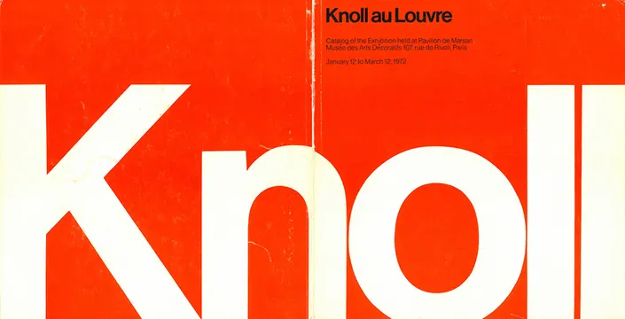
Bold red and cream exhibition catalog cover for Knoll at the Louvre, January–March 1972, featuring large-scale serif typography.
Summary
A striking 1972 exhibition catalog cover announcing Knoll's presence at the Louvre (Pavillon de Marsan, January 12–March 12, 1972). Bold "Knoll au Louvre" headline in large serif type set against a vivid red field with cream trim.
Visual description
A landscape catalog cover with a dominant red background bisected by a narrow cream spine, showing the title "Knoll au Louvre" in oversized serif capitals running vertically along the spine. Top right corner carries exhibition details in small sans-serif caption text. The composition is rigorously asymmetric, relying entirely on the contrast between the saturated red and natural cream to create visual impact.
Key takeaway
Maximum impact through radical simplicity—one bold color, one large typeface, essential text only. This exemplifies Swiss design restraint applied to an institutional/luxury context where boldness reads as confidence, not noise.
Reuse notes
Reference for editorial/exhibition identity, high-contrast layouts, or serif display typography at scale. Works particularly well for luxury goods, cultural institutions, or retrospective/historical projects. The color combination is striking and legible from distance. Not suitable for contexts requiring visual warmth or complexity.
More like this



Keep what you find
A free account saves references to boards and can send you a weekly email of picks based on what you save.
To see every result, go Pro.