
Preview image. Unlock full-res
A 17-slide selection from OpenAI's 2022 brand guidelines built on a strict black-white-electric-blue system, pairing an oversized Signifier serif with the Söhne sans across a numbered, hairline-ruled grid.
Summary
A curated 17-slide cut of OpenAI's 2022 brand guidelines (version 1.0.1, prepared by AREA 17). Its whole identity is a Swiss-grid system in pure black and white, punctuated by one electric blue, that pairs an oversized Signifier serif for display moments with the Söhne sans for everything functional.
Visual description
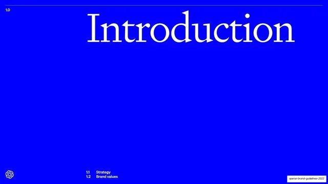
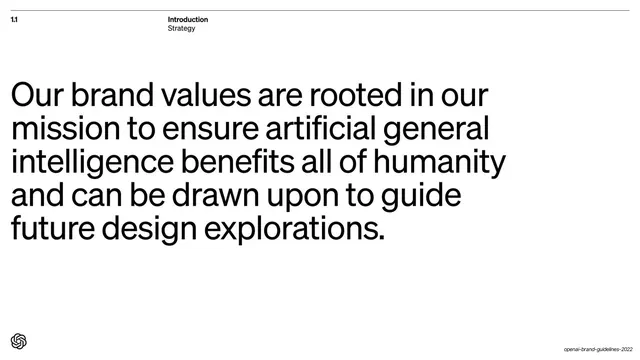
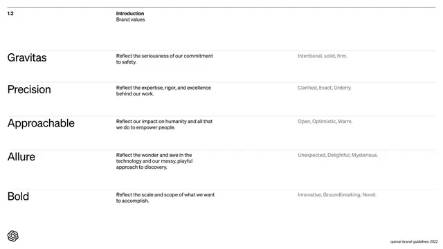
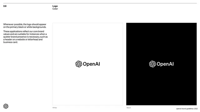
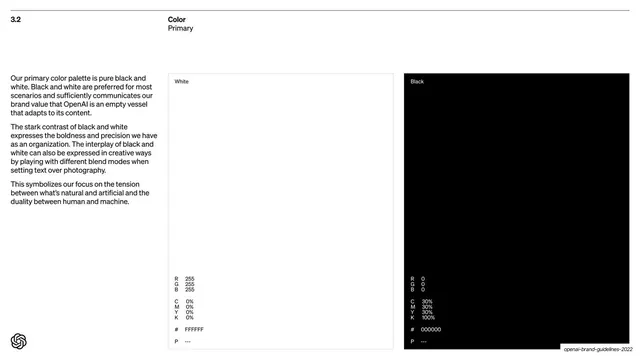
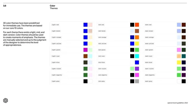
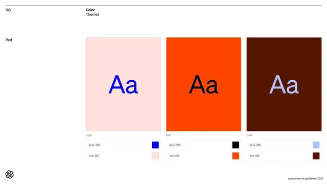
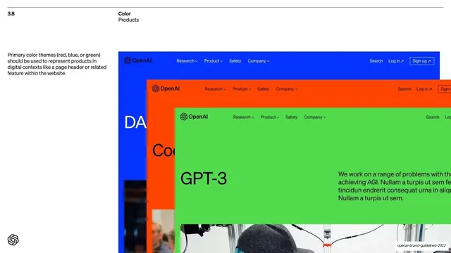
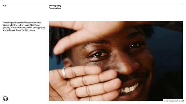
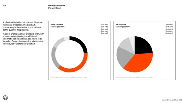
Slides run 16:9. The system is built on near-pure black (#000000) and white, with a single saturated electric blue (#0A1AFF) used for full-bleed section dividers and accents, plus an orange (#FF4D00) appearing in the data-viz and color-theme examples. Two type families carry the deck: a high-contrast Signifier serif used very large for cover and section-divider words ("Introduction", "Color", "Our mission..."), and the Söhne grotesque sans used for all body copy, oversized statement slides, swatch labels and captions, with Söhne Mono for code-style swatch specs. Every page sits on a strict grid: a thin hairline rule runs across the top, a numbered index (1.0, 2.6, 3.8) sits in the top-left, and a two-line section/subsection label ("Color / Themes", "Logo / Color") sits centered-left in the same row. The OpenAI knot logo anchors the bottom-left of content pages; on section dividers it shrinks to a small mark. Recurring layouts: full-bleed colored section dividers with one giant serif word plus a numbered table of contents; oversized Söhne statement slides where a single sentence fills the lower or full frame; two- and three-column swatch and theme grids; a split text-left / image-right template for logo, color and photography pages; and framed chart modules for data visualization. Whitespace is generous and decoration is essentially absent.
Key takeaway
The discipline of a two-typeface system doing all the work: a dramatic serif reserved for big brand moments and a neutral grotesque for everything else. The numbered, hairline-ruled running header that turns a guideline into a navigable manual. And the restraint of an almost entirely black-and-white palette that earns its impact by deploying one electric blue only on full-bleed dividers.
Reuse notes
A definitive reference for brand-guideline and design-system decks, and for any documentation that needs to feel authoritative and engineered rather than decorated. The divider-plus-table-of-contents pattern and the framed swatch and chart modules are directly reusable. The look depends on a strong serif/sans pairing and a confident single accent; swap Signifier and Söhne for your own faces but keep the contrast between an expressive display serif and a neutral workhorse sans.
From this deck: OpenAI Brand Guidelines 2022
View deck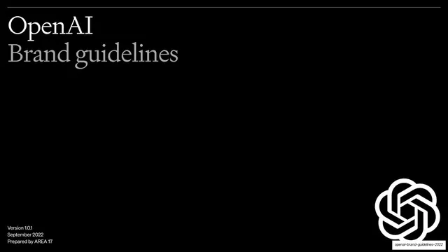



More like this









Keep what you find
A free account saves references to boards and can send you a weekly email of picks based on what you save.
To see every result, go Pro.