Preview image. Unlock full-res
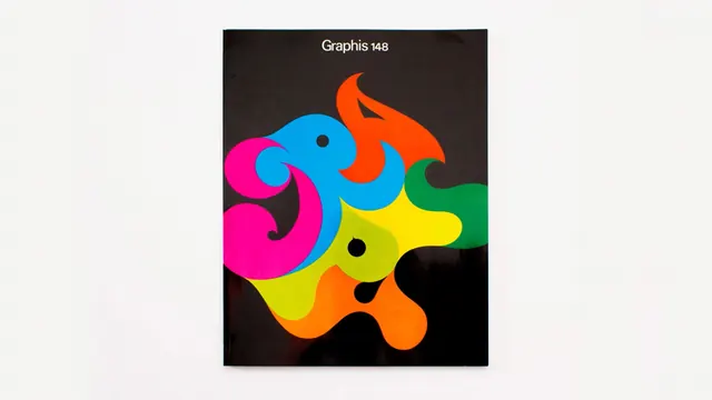
Magazine cover with black background featuring a bold, flat-color abstract swirled illustration in pink, blue, orange, yellow and green.
Summary
The cover of Graphis magazine issue 148, featuring an eye-catching abstract flat-color illustrated mark with organic swirled forms in saturated primary and secondary colors against a near-black background.
Visual description
Black magazine cover with centered, bold abstract illustration composed of interlocking organic swirled shapes. The mark uses flat, solid fills in bright magenta, cyan blue, orange, yellow, and green, with some shapes appearing to interlock or overlap slightly. Two small black circular dots serve as accents within the composition. The "Graphis 148" text appears at the top in white serif type. The vibrant color palette creates maximum visual impact against the dark background, and the organic abstract forms suggest movement and vitality while maintaining graphic clarity.
Key takeaway
Restrained color palette paired with bold saturated application creates immediate visual impact. The abstract mark is both decorative and graphically sophisticated, demonstrating that editorial covers can prioritize artistic expression while maintaining legibility and brand presence.
Reuse notes
Excellent reference for magazine and editorial design seeking distinctive visual identity. Works for publications wanting to project creative, contemporary sensibility. The saturated flat colors on dark background are attention-grabbing at thumbnail scale and reproduction-friendly. Pairs well with clean typography and generous white space in layout.
More like this

Keep what you find
A free account saves references to boards and can send you a weekly email of picks based on what you save.
To see every result, go Pro.