Preview image. Unlock full-res
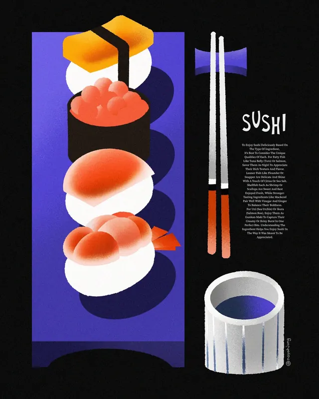
Food poster pairing stacked 3D-rendered sushi against a vibrant indigo field with complementary copy and chopsticks illustration on a black ground.
Summary
Poster design featuring glossy 3D-rendered sushi stacked vertically in foreground against a bold indigo field, paired with minimalist white-and-orange chopsticks and justified text block on a black background.
Visual description
Left half (on dark background): vertical stack of four sushi pieces rendered in glossy 3D with soft shadows, orange roe/filling visible on white rice, organized along a central axis with organic spacing. A rich indigo-blue panel behind and slightly beside the sushi creates a vibrant color field. Right half (black ground): oversized white sans-serif type spelling "sushi," followed by justified body text (small, white, high-readability), a pair of white chopsticks with orange/red accent tips (centered below text), and a minimalist white bowl with dark-blue interior at the base. Orange and indigo are complementary; white and black provide stark contrast. Composition is left-heavy (sushi + field) and right-light (text + utensils + bowl).
Key takeaway
The vertical stacking of product (sushi) with consistent soft shadows and glossy finish to make it feel tangible despite 3D rendering. The bold indigo field behind the product, isolated on the left, creating depth without a full background. The text-only right side balances the visual weight without competing for attention. Chopsticks as a secondary element, stylized but recognizable, reinforce the subject matter.
Reuse notes
Ideal for food/beverage brands, restaurant menus, or culinary packaging. The complementary orange-and-indigo palette reads as premium and modern. Works best when product photography or rendering is high-quality and photorealistic. The composition assumes horizontal format; text should remain right-aligned or centered. Caveat: the small body text is harder to read at thumbnail scale.
More like this








Keep what you find
A free account saves references to boards and can send you a weekly email of picks based on what you save.
To see every result, go Pro.