Preview image. Unlock full-res
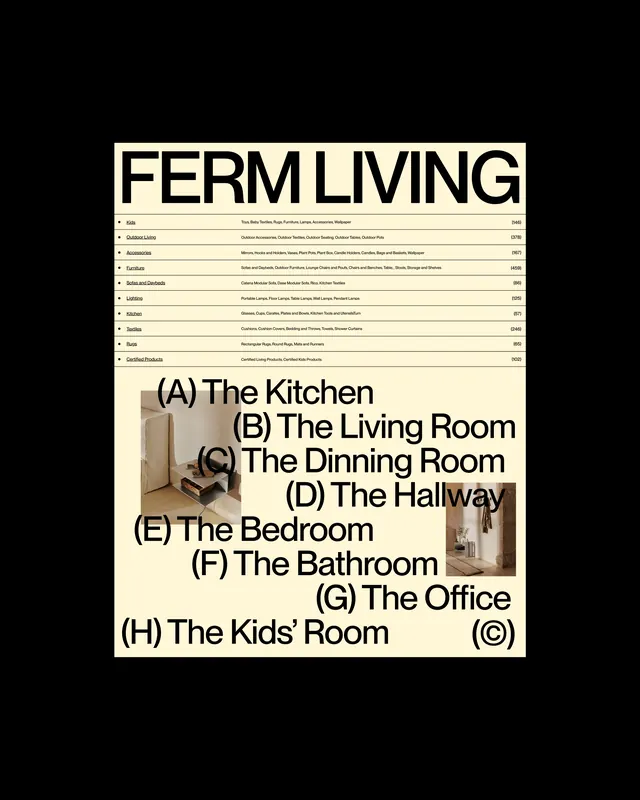
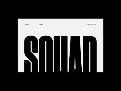
A clean editorial page layout with a beige-to-dark gradient palette arranged in an organized grid structure, suitable for design portfolio or magazine presentation.
Summary
An editorial design layout with a sophisticated two-tone palette of warm beige and deep black, organized into a structured grid system that emphasizes visual hierarchy and whitespace.
Visual description
The layout features a rectangular composition with a dominant beige background occupying approximately 58% of the space, contrasted with deep black accounting for 41%. The arrangement suggests a grid-based approach typical of editorial design, with clear separation between dark and light zones creating visual balance through geometric division.
Key takeaway
The minimalist color contrast and geometric grid structure demonstrate how a two-color palette can create a sophisticated, professional aesthetic. The substantial negative space in lighter tones allows emphasis to fall on strategic dark elements, perfect for editorial contexts where content hierarchy matters.
Reuse notes
Ideal for magazine layouts, portfolio covers, or editorial design systems that require clean, sophisticated aesthetics. The palette works well for luxury brands, art publications, or minimal design-focused content. The grid-based approach supports flexible content placement across sections.
More like this



Keep what you find
A free account saves references to boards and can send you a weekly email of picks based on what you save.
To see every result, go Pro.