Preview image. Unlock full-res
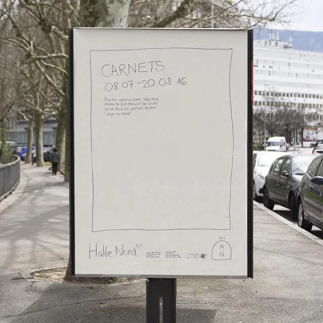
Street-mounted wayfinding sign with white panel, thin black frame, and sparse typographic hierarchy using generous negative space and align-left text.
Summary
A minimalist street sign mounted within a thin black frame, featuring a white rectangular panel with sparse, left-aligned typographic content and substantial white space around the text.
Visual description
A mounted outdoor sign with a dark metal frame holding a large white rectangular panel. The panel displays text in a clean sans-serif typeface positioned in the upper-left area, leaving the majority of the surface as blank white. The typography is restrained: only a few lines of text appear, aligned to the left, with generous margins on all sides. The extreme simplicity and negative space create an institutional, almost gallery-like aesthetic. The monochromatic palette (pure white, black frame, neutral grays) emphasizes clarity and legibility against the urban environment visible in the photograph background.
Key takeaway
The power of sparse typography on a white field. By using minimal text and positioning it carefully, the sign achieves maximum impact and readability from a distance. The restraint shows that effective wayfinding does not need to fill the available space. The thin black frame creates a contained canvas without feeling heavy or obstructive.
Reuse notes
Ideal for museum, gallery, and institutional wayfinding systems where quiet elegance matters more than visual complexity. Works in environments where the design needs to integrate with architecture rather than compete with it. Apply this approach when targeting an educated audience familiar with minimal design language. The monochromatic scheme makes it adaptable to many architectural contexts.
More like this




Keep what you find
A free account saves references to boards and can send you a weekly email of picks based on what you save.
To see every result, go Pro.