Preview image. Unlock full-res
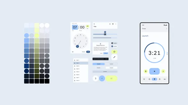
A Material Design system reference showing a color palette grid, time-picker dialog, settings panels, and timer app mockup on a light blue-gray background.
Summary
A comprehensive Material Design system reference displaying color swatches, interactive component mockups including a time picker and settings panel, and a mobile timer app interface with blue accents and yellow highlights.
Visual description
Light blue-gray background spans the full width. On the left, a dense color palette grid with approximately 40 color swatches arranged in rows shows a progression from light neutrals and blues to deep navy and black, with a yellow accent row. Center section displays two overlaid dialog mockups: a time-picker showing "07:00" with hour and minute spinners and a circular dial interface, and a settings panel with toggle switches and item lists. All dialogs have "OK" and "Cancel" buttons in navy blue. On the right, a tall mobile phone mockup displays a timer app with "3:21" displayed in large typography inside a blue circular progress ring, control buttons below (delete, pause, equals, next, confirm), and navigation icons at the bottom.
Key takeaway
Material Design's system-first approach, where color, typography, and component behavior are shown together as an integrated toolkit. The bold blue accent unifies disparate UI elements. The combination of swatches, dialogs, and live app mockup demonstrates how design systems scale from palette to product.
Reuse notes
Strong reference for designing Material Design products or for understanding Google's design system principles. The color progression is useful for establishing neutral and primary color hierarchies. The time-picker and settings panels are reusable component patterns. Works well as inspiration for design system documentation or for teams adopting Material Design. The phone mockup shows how components behave in a real app context.
More like this

Keep what you find
A free account saves references to boards and can send you a weekly email of picks based on what you save.
To see every result, go Pro.