Preview image. Unlock full-res
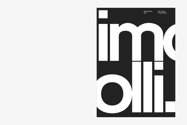
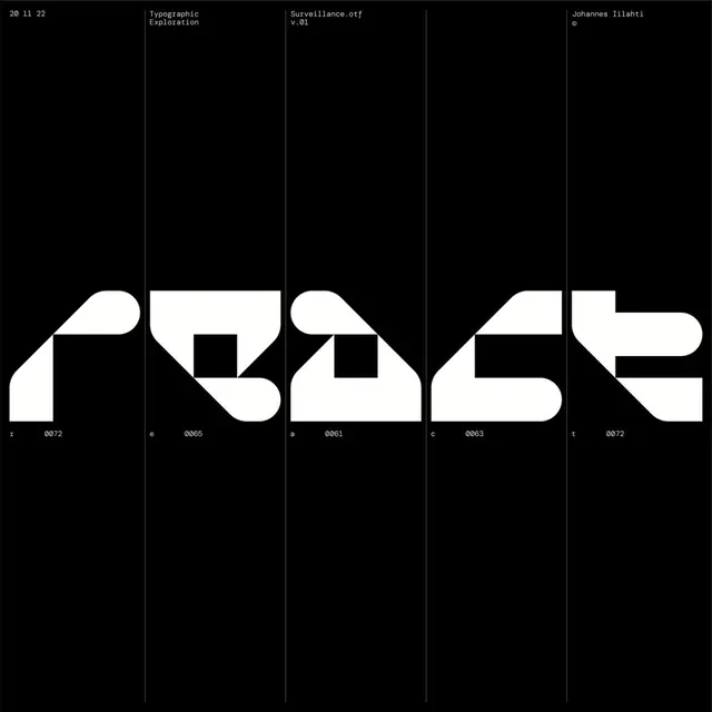
Experimental display typeface featuring bold geometric letterforms with partial character visibility in monochrome.
Summary
An experimental geometric sans-serif typeface display showing bold letterforms in black and white with partial character cropping and annotation labels.
Visual description
Black background with white and gray geometric letterforms displayed at large scale. Characters appear to be parts of an alphabet—partial views of oversized sans-serif letters with strong geometric construction (circular strokes, perfect angles, minimal curves). Small text labels appear in the upper right ("Sik-Modernist Bold", "Kern it tight, or keep it light"). A lowercase 'a' is prominently featured as a large geometric shape. The composition uses negative space effectively, with letters positioned to suggest a larger alphabet system. High contrast monochromatic palette emphasizes form over detail.
Key takeaway
Demonstrates how to showcase a typeface through partial, zoomed-in views rather than full character sets. The geometric precision and monochrome palette position the font as contemporary and technical. Annotation labels add context about font characteristics.
Reuse notes
Excellent for type design portfolios, contemporary design systems, or modernist branding. The approach of showing letters at dramatic scale works for exhibitions and posters. Best suits geometric, minimal, or tech-forward brands. Requires strong letterforms to be interesting in isolation. Works well in both print and digital contexts with strong visual hierarchy.
More like this



Keep what you find
A free account saves references to boards and can send you a weekly email of picks based on what you save.
To see every result, go Pro.