
Preview image. Unlock full-res
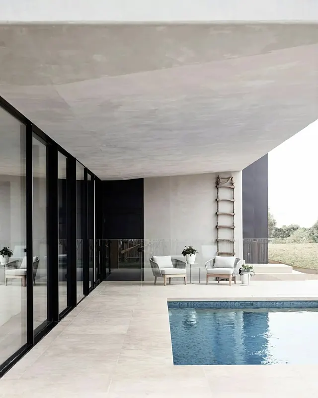
Minimalist abstract composition with light gray as the dominant element and near-black accents, creating an unbalanced but intentional visual hierarchy.
Summary
A minimalist composition dominated by light gray with strategic near-black accents at approximately 25%, demonstrating restraint through an intentionally unbalanced color distribution.
Visual description
Light gray (#C7C7C7 at 73.1%) dominates the tall rectangular format (1080x1440), with near-black (#1C1C1C at 25.8%) providing sparse but purposeful visual anchors. The portrait orientation emphasizes the vertical space and the minimalist philosophy of using negative space as a primary design element.
Key takeaway
The intentional imbalance between the two colors—favoring light gray overwhelmingly—shows that effective minimal design doesn't require perfect symmetry. The sparse dark elements create focal points despite their minimal presence.
Reuse notes
Excellent for contemporary brand applications seeking visual lightness and sophistication. Works well as a background for product photography, editorial layouts, or minimalist web design. Particularly suited for tech companies, design agencies, or luxury brands valuing simplicity. The ratio of light to dark makes it ideal for content-heavy applications where the background should be unobtrusive.
More like this





Keep what you find
A free account saves references to boards and can send you a weekly email of picks based on what you save.
To see every result, go Pro.