Preview image. Unlock full-res
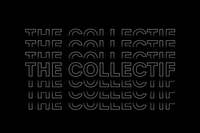
The words "THE COLLECTIF" repeated and stacked in an all-caps outline serif typeface against a black background.
Summary
An outline serif typeface spelling "THE COLLECTIF" layered vertically in a repeating pattern on a black background, showcasing a visual identity system.
Visual description
Black background with white outline letterforms stacked and slightly offset vertically. Each instance of "THE COLLECTIF" is rendered in a crisp serif typeface with just the stroke visible, creating an optical rhythm through repetition. The outlines are consistent in weight and spacing, producing a clean, geometric composition.
Key takeaway
Using outline type and strategic repetition creates depth and visual interest while maintaining clarity and legibility as a core identity device.
Reuse notes
Strong reference for brand identity systems, type-forward design, or applications needing a distinctive typographic mark. The outline treatment works especially well for striking monochromatic presentations.
More like this
Keep what you find
A free account saves references to boards and can send you a weekly email of picks based on what you save.
To see every result, go Pro.