Preview image. Unlock full-res
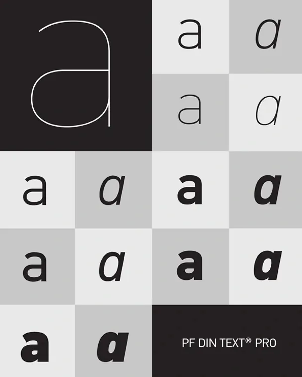
A typographic grid showing variations of the letter 'a' in PF DIN Text Pro across different weights and styles, with a minimalist line drawing icon in the corner.
Summary
A systematic typography reference showing the letter 'a' rendered in multiple weights and styles of PF DIN Text Pro, with a minimalist curved-line icon positioned in the upper left.
Visual description
Dark background on the left side with a simple line-drawn circular icon. The remainder is a gridded type specimen showing the letter 'a' repeated across eight squares in varying weights, sizes, and fills (outlined and solid), paired with a typeface name label on a black background.
Key takeaway
Using a grid layout to systematically display typeface variations creates a clean, scannable reference for comparing letter forms across weights.
Reuse notes
Reference this for type specimen design patterns when presenting font weights and styles. The high-contrast checkerboard treatment and clean labeling work well for type system documentation.
More like this




Keep what you find
A free account saves references to boards and can send you a weekly email of picks based on what you save.
To see every result, go Pro.